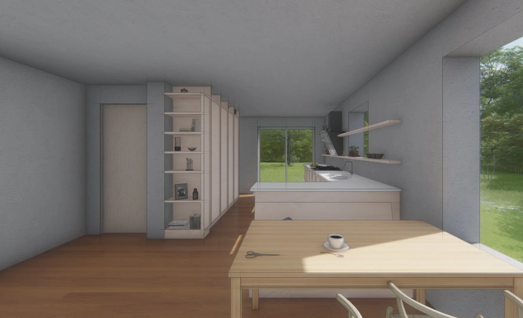
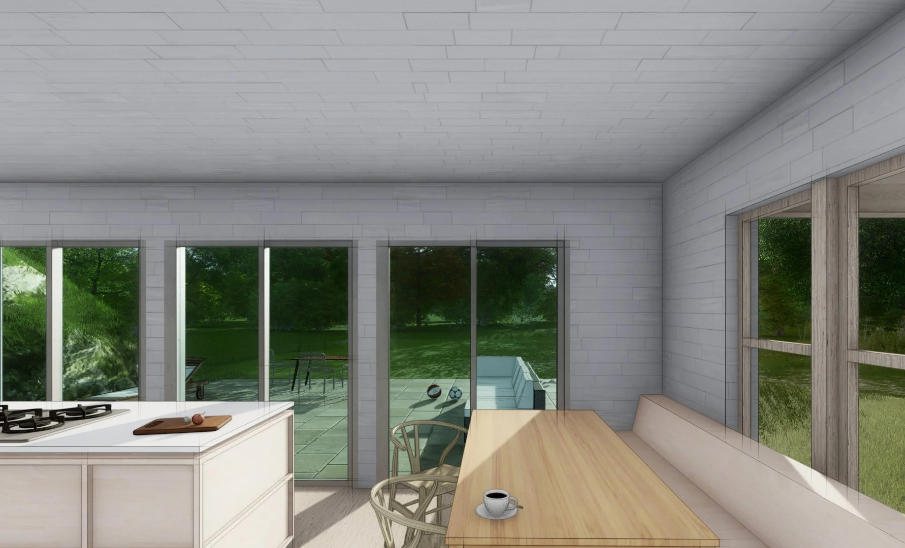
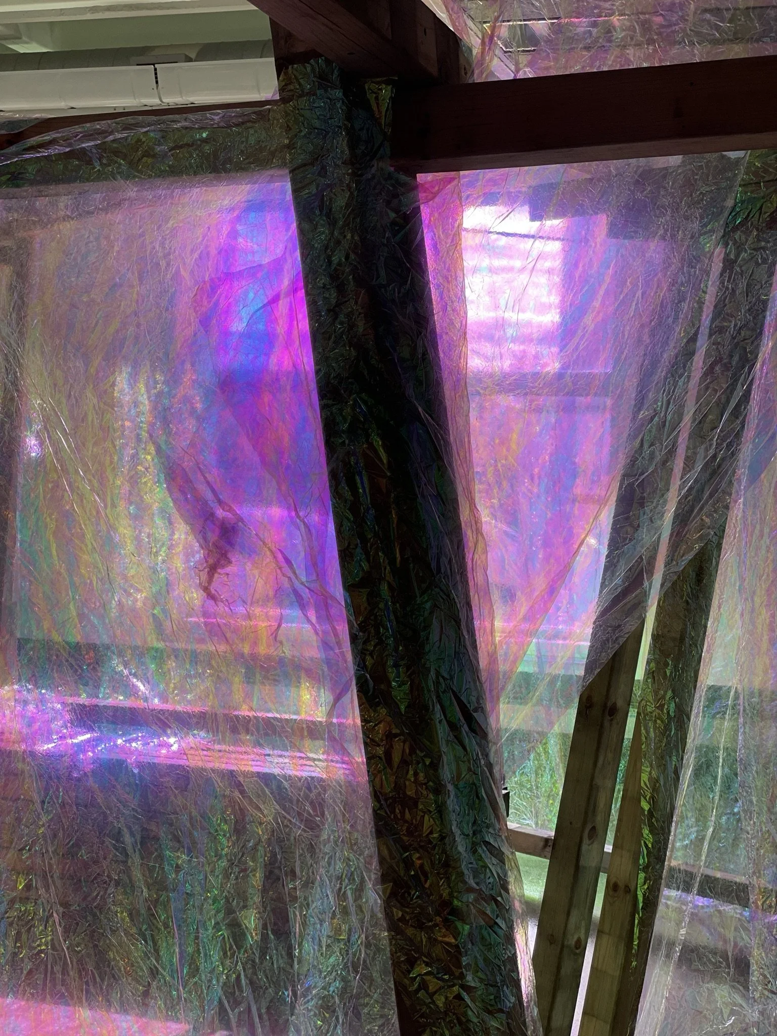
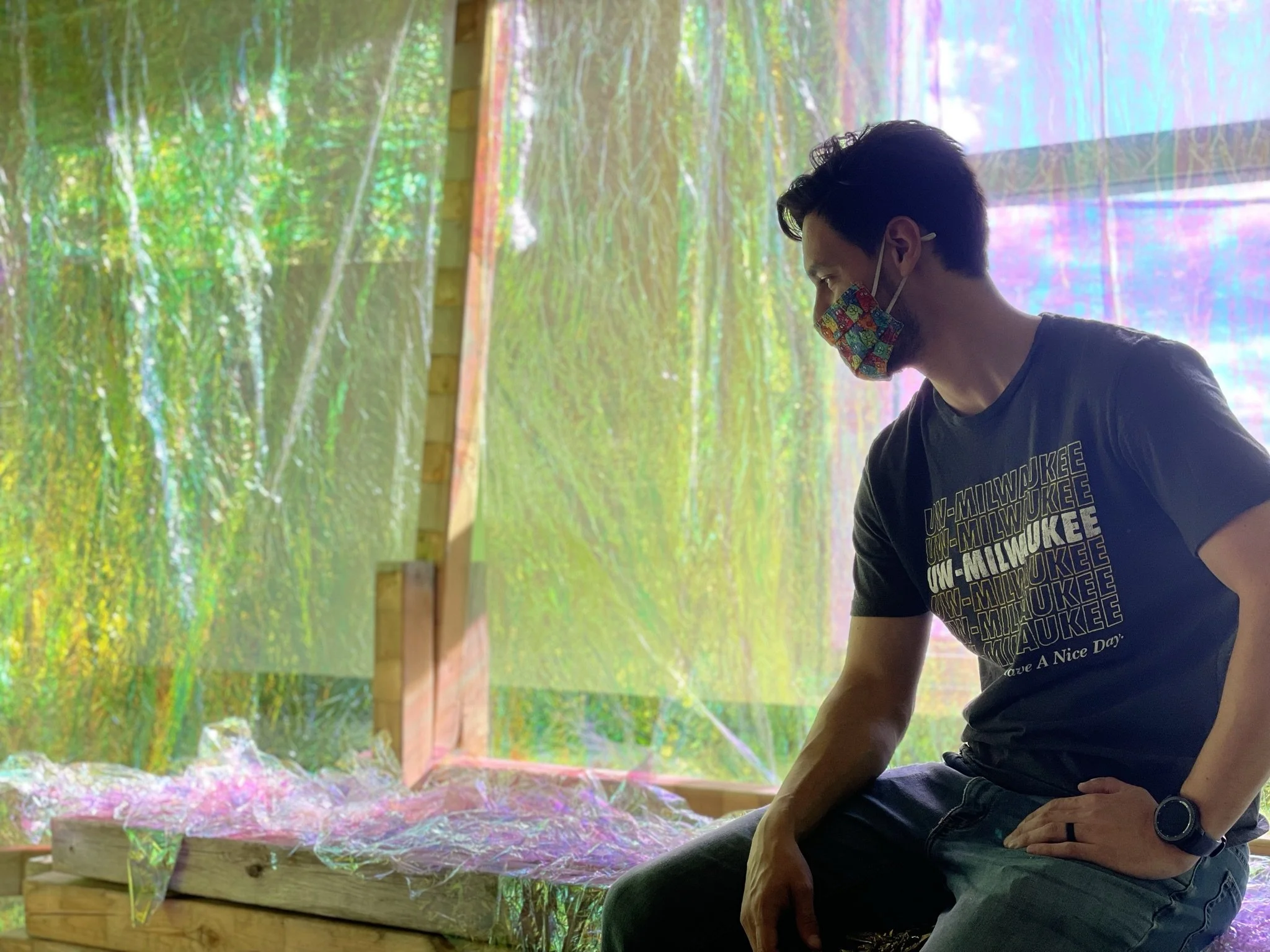
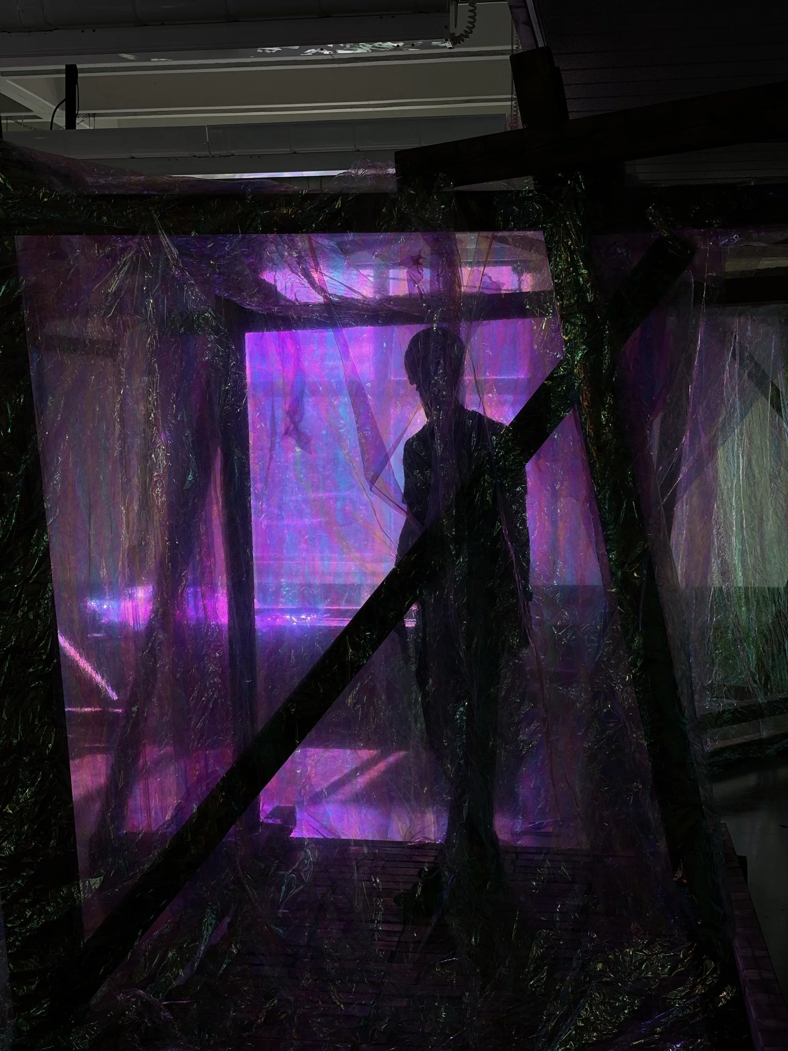
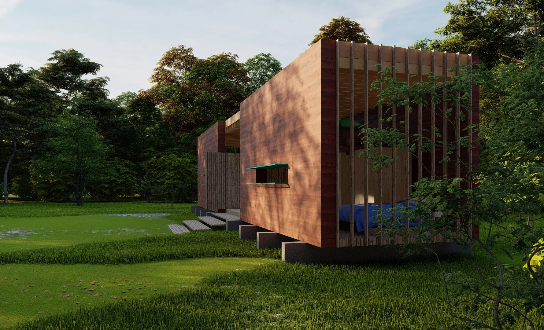
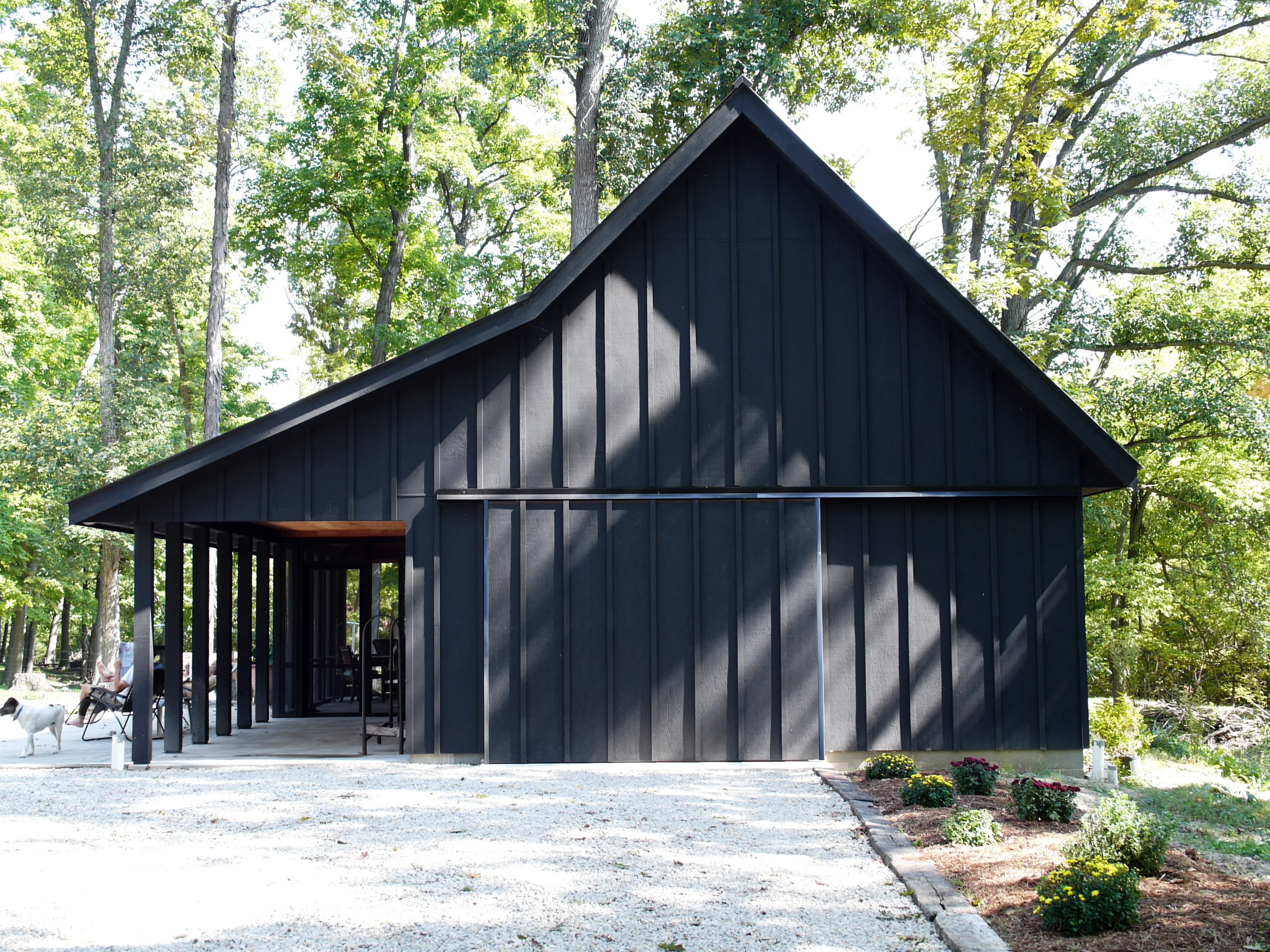
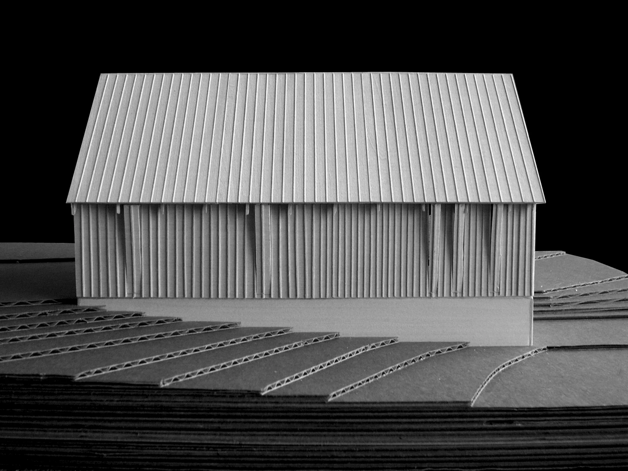
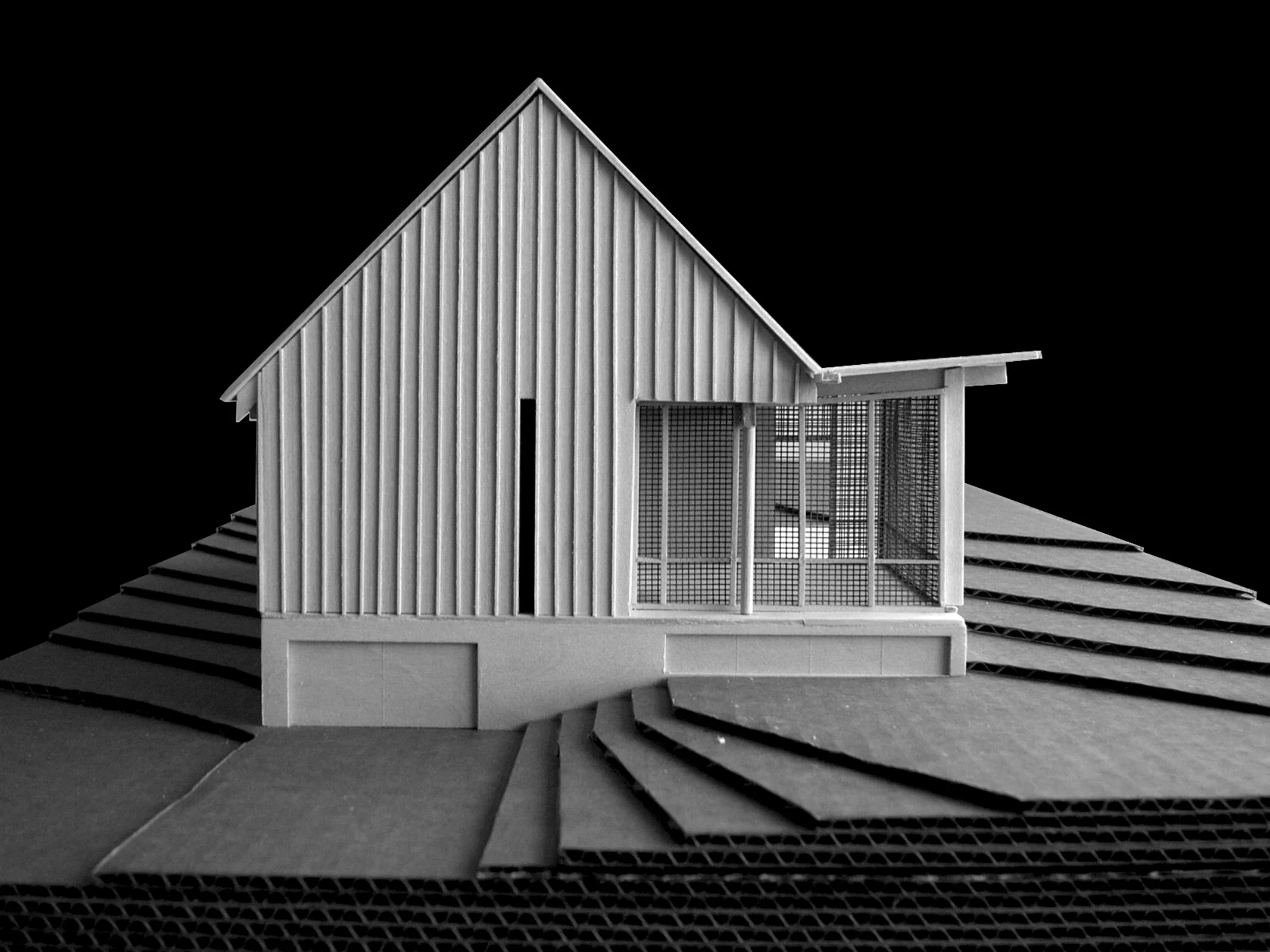
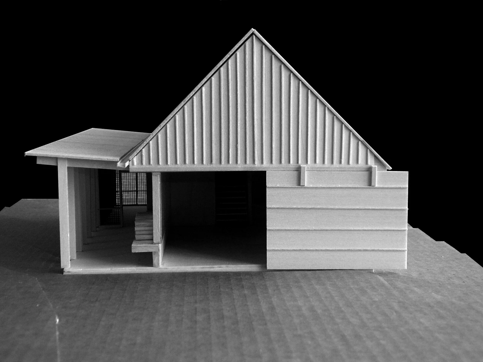
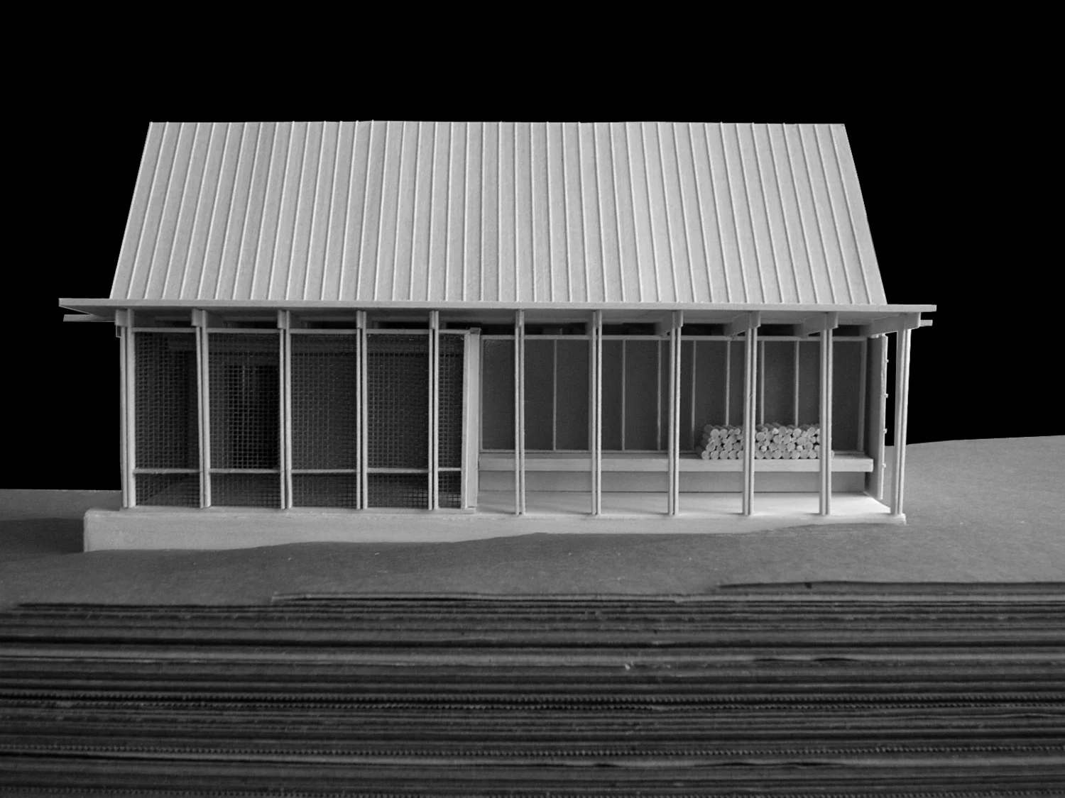
Prefab cabin design for a summer camp in Wisconsin. Designed to be built in pairs separated by a shared open-air covered porch. construction is a simple stacked heavy timber wall system and CLT planks that can be built off-site. The covered porch encourages socialization and natural ventilation. Large wooden sliding doors can be opened to signal that you are ‘home’ or closed for privacy. Large screened window openings enhance ventilation on balmy summer days. This cabin has a small loft area big enough for either storage or another bed and is flexibly designed to be used as a single or family staff cabin with an optional bath and kitchen module. These cabins will be used by staff during the summer session and rented to vacationers during the off-season to supplement camp revenues
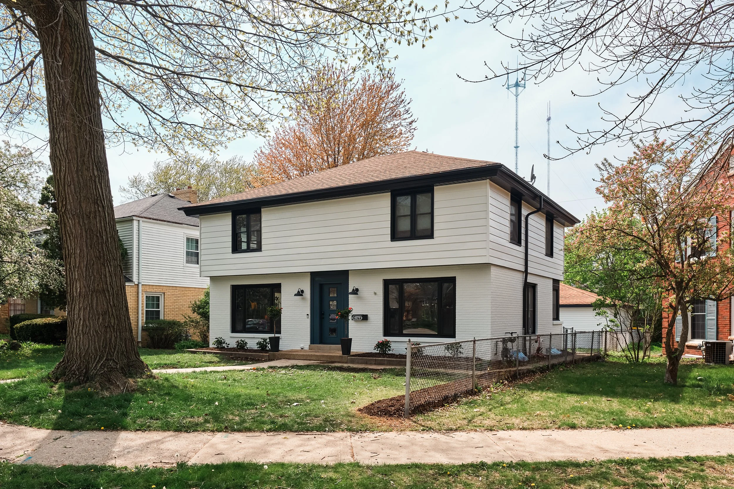
This modest Tudor house conceals a completely updated and reconfigured interior for a young busy family. Ware was responsible for all aspects of this whole house remodel included updating all windows, roof, and mechanicals. In addition to the new kitchen, living room, and office downstairs, the upstairs was completely re-designed to include a master suite and a new children’s bathroom. The basement was also finished to include a recreation room.
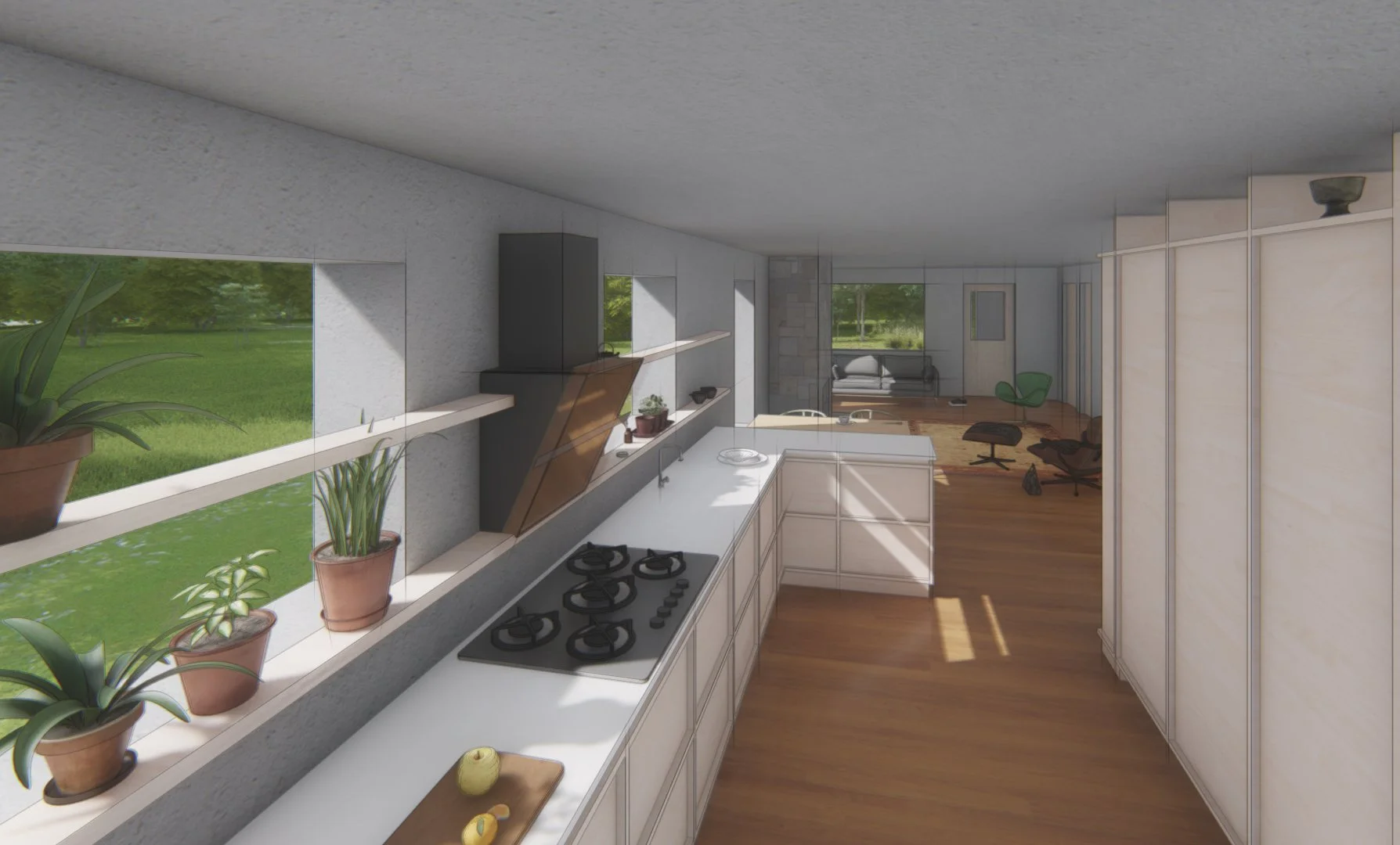
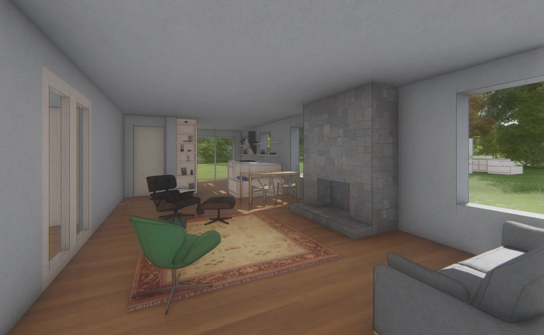
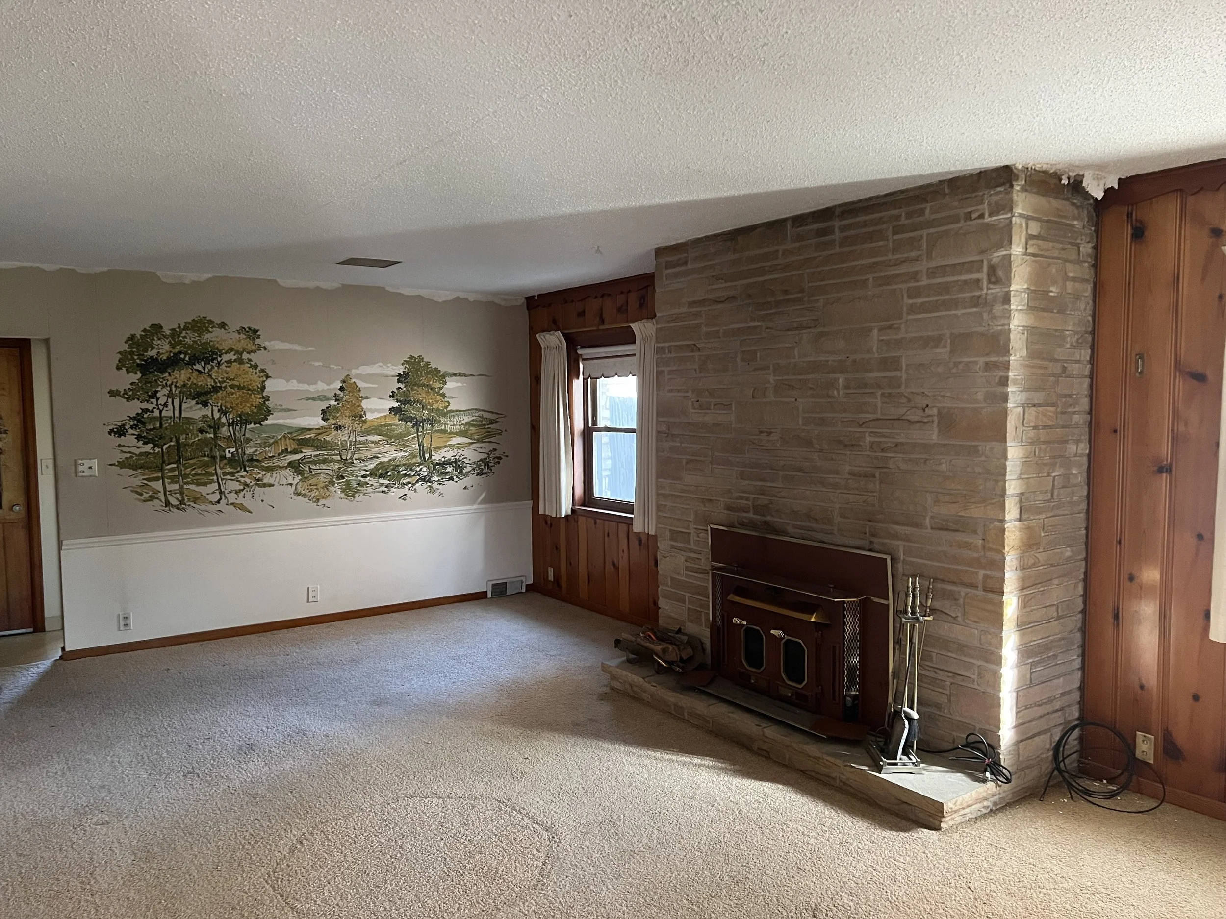
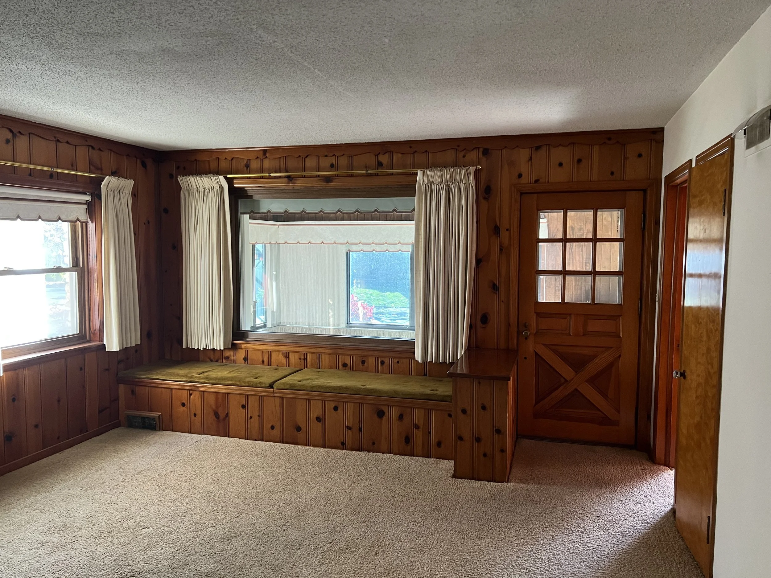
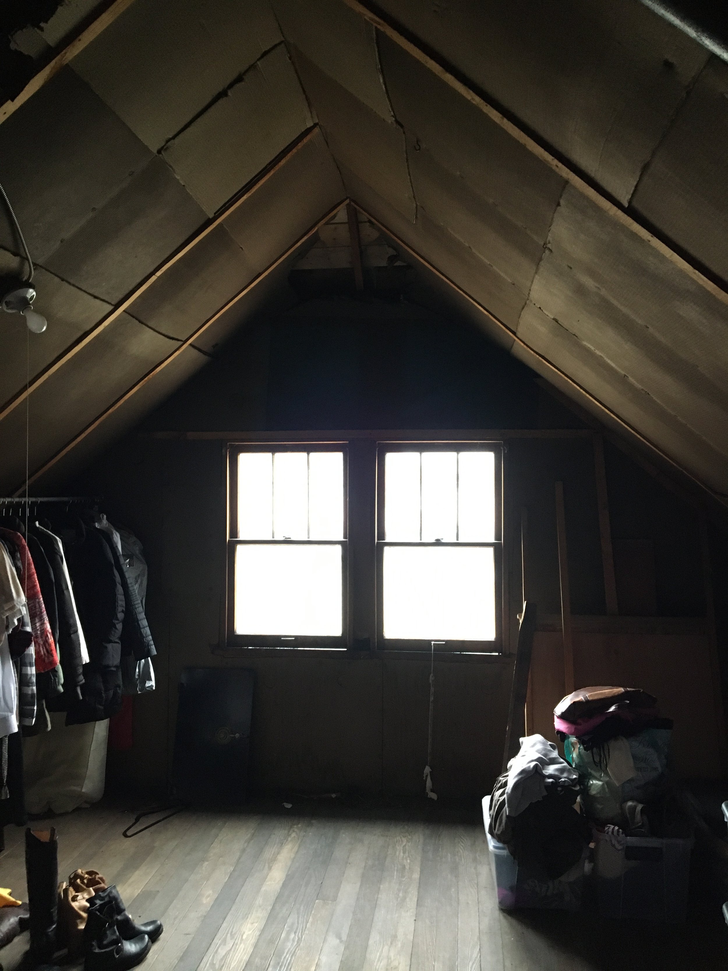
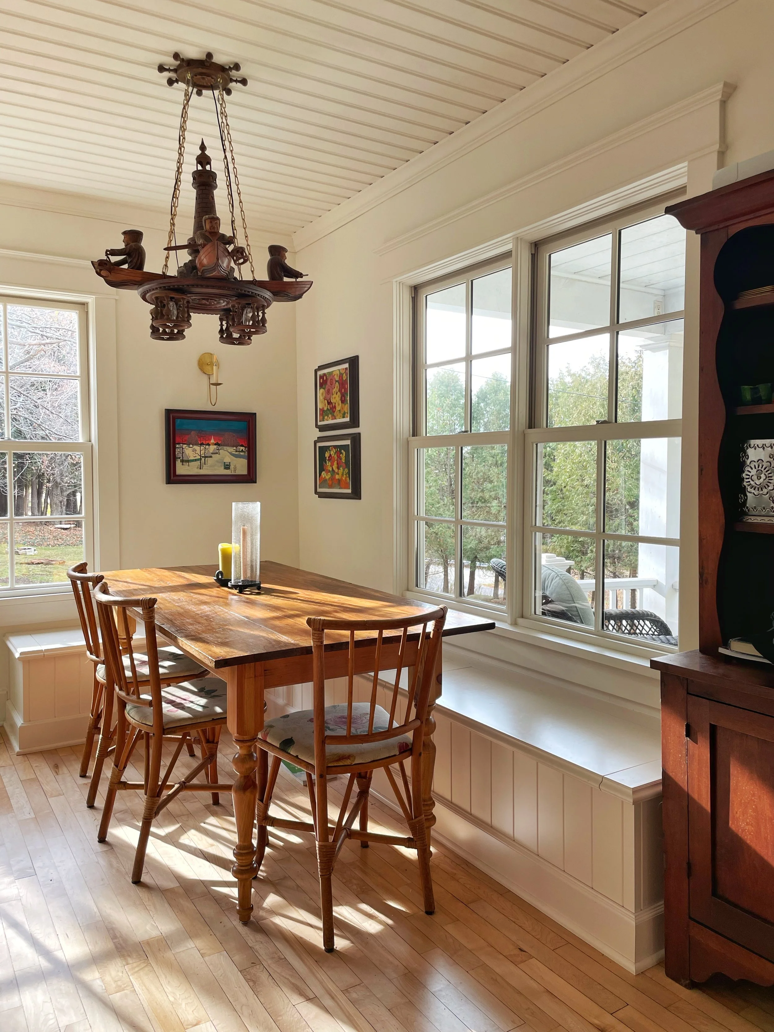
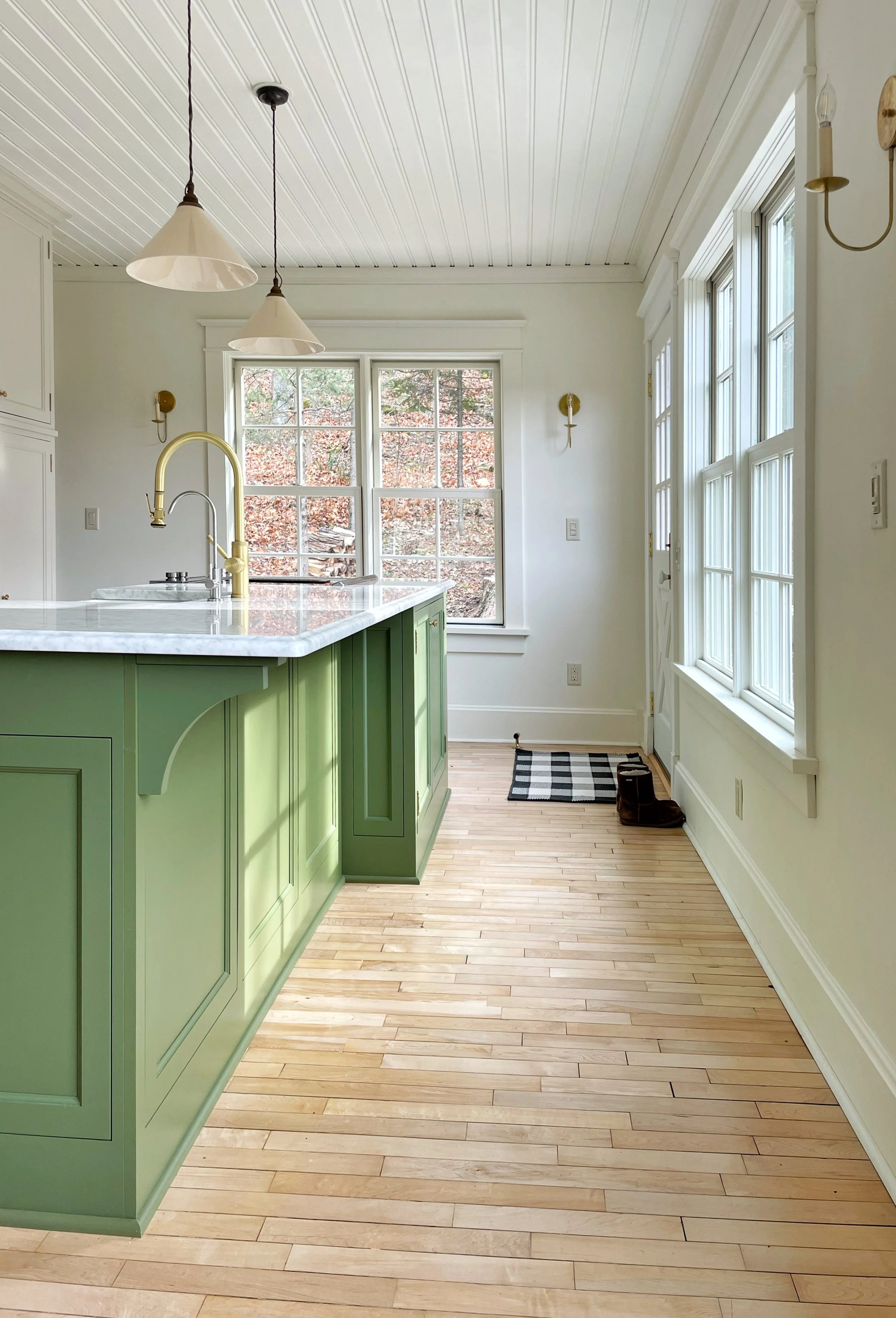
Neglected for years, this Door County cottage was ripe for updating. The dark and enclosed first floor interior was opened up to improve visual and physical access to the gorgeous side yard. A possible future patio extends the small square footage into a large outdoor living room.
This timber portal is built completely from non-custom off-the-shelf elements. Thinking about craft and commodification, we sought to elevate everyday building components to a special architectural experience through imprecise assembly and intense tectonic articulation. The pavilion is comprised of 445 individual parts, but required only 58 cuts, is fastened with 900 screws, and offers a shady respite for enjoying SARUP's architectural garden.
A beautiful meadow in Illinois inspired the linear arrangement of this home for a retired couple. The challenge of providing solar protection on the eastern elevation meant merging a stacatto composition of wood fins with a fully glazed enfilade between all the dwelling rooms.
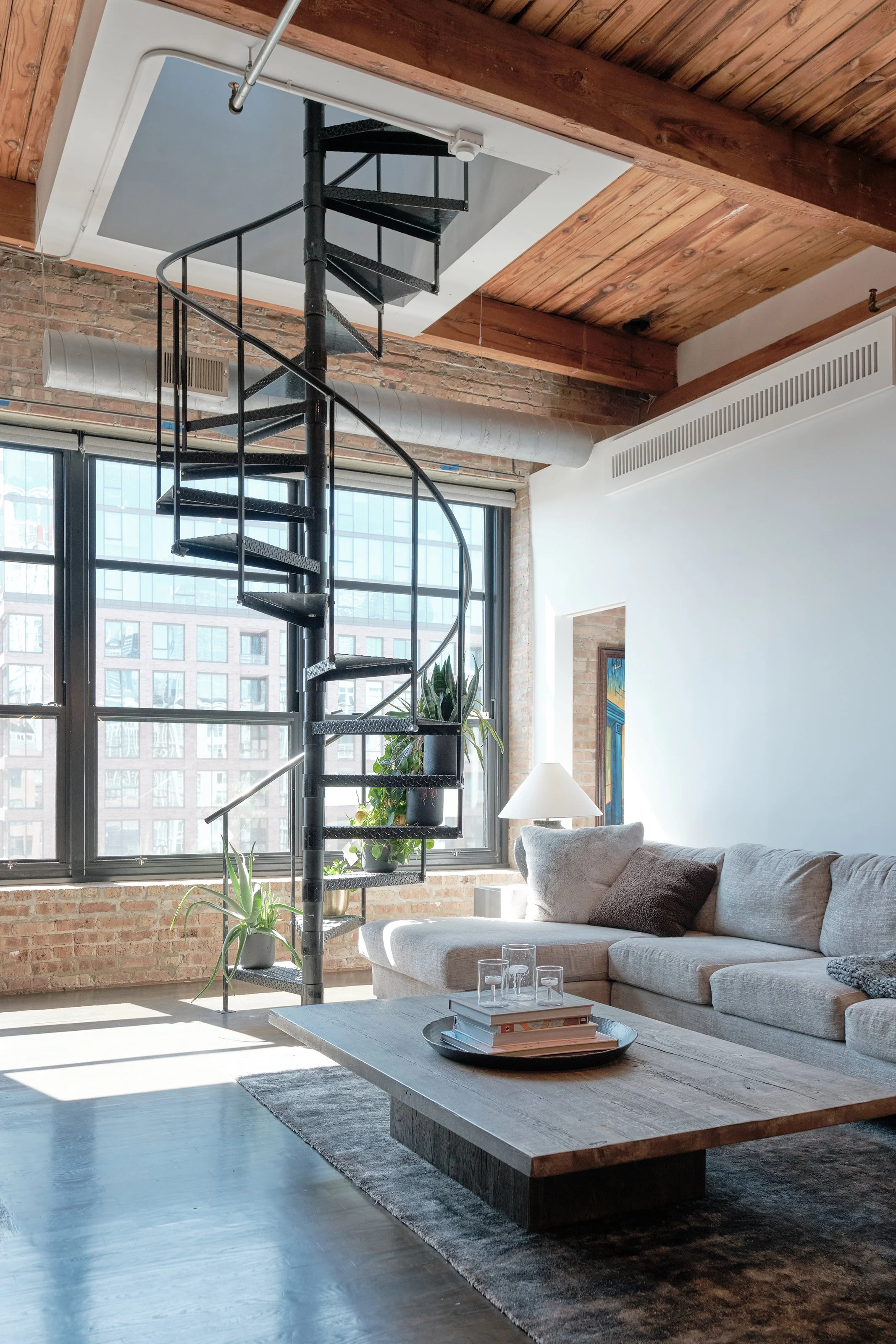
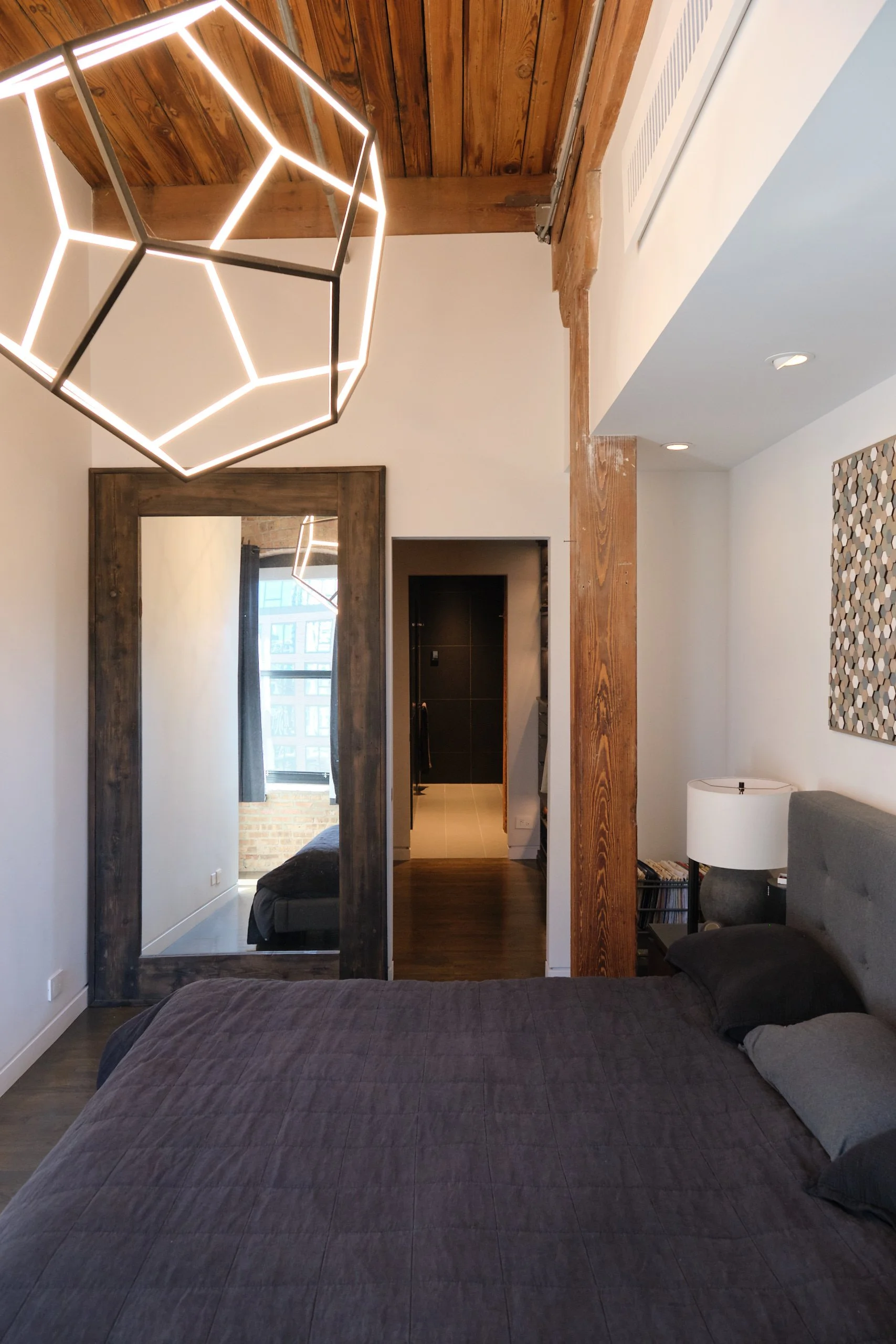
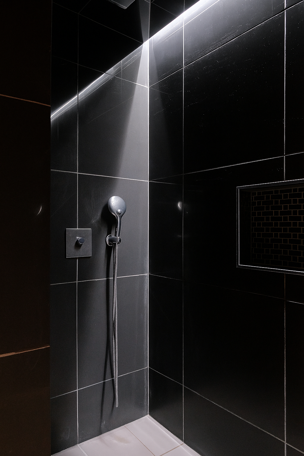
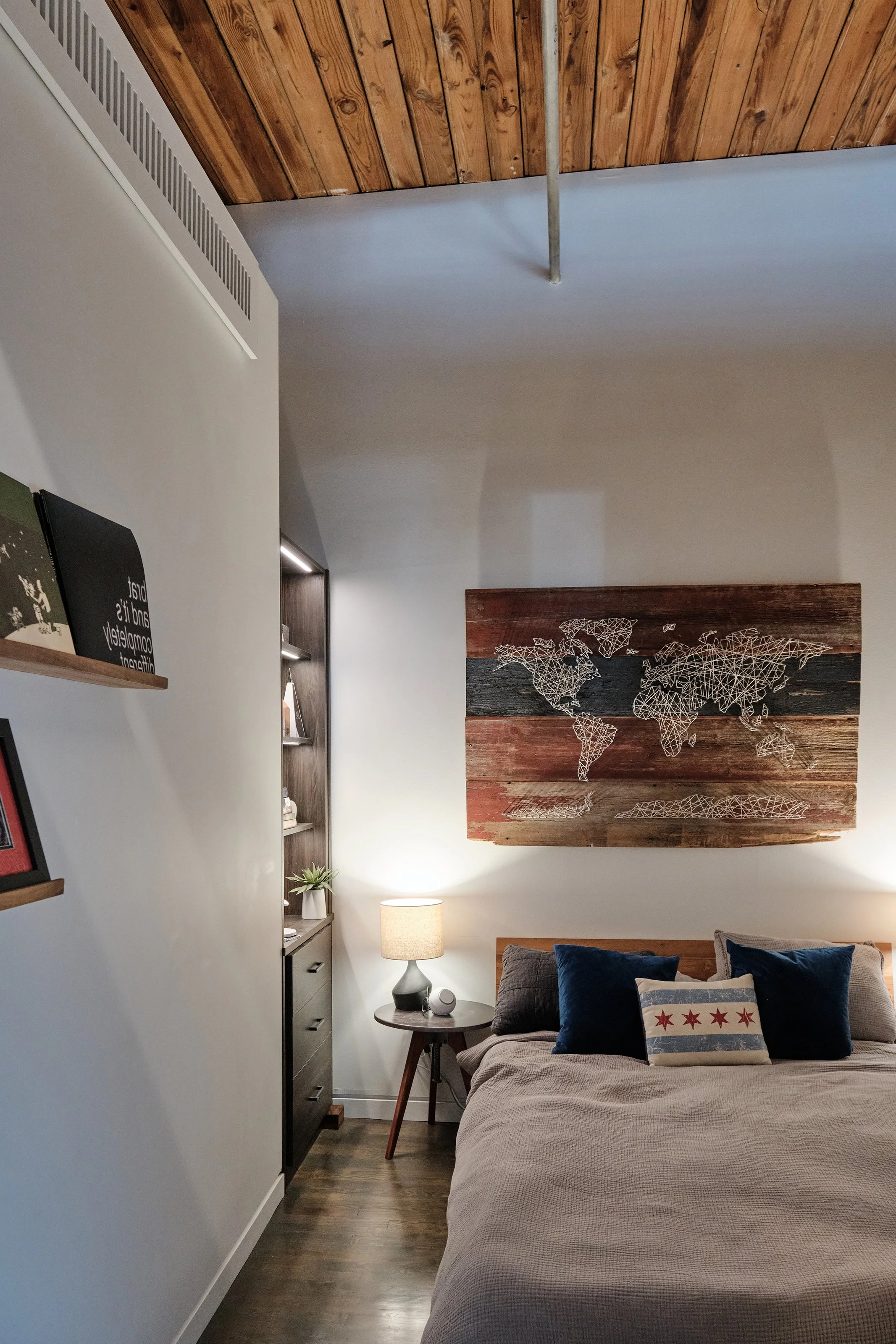
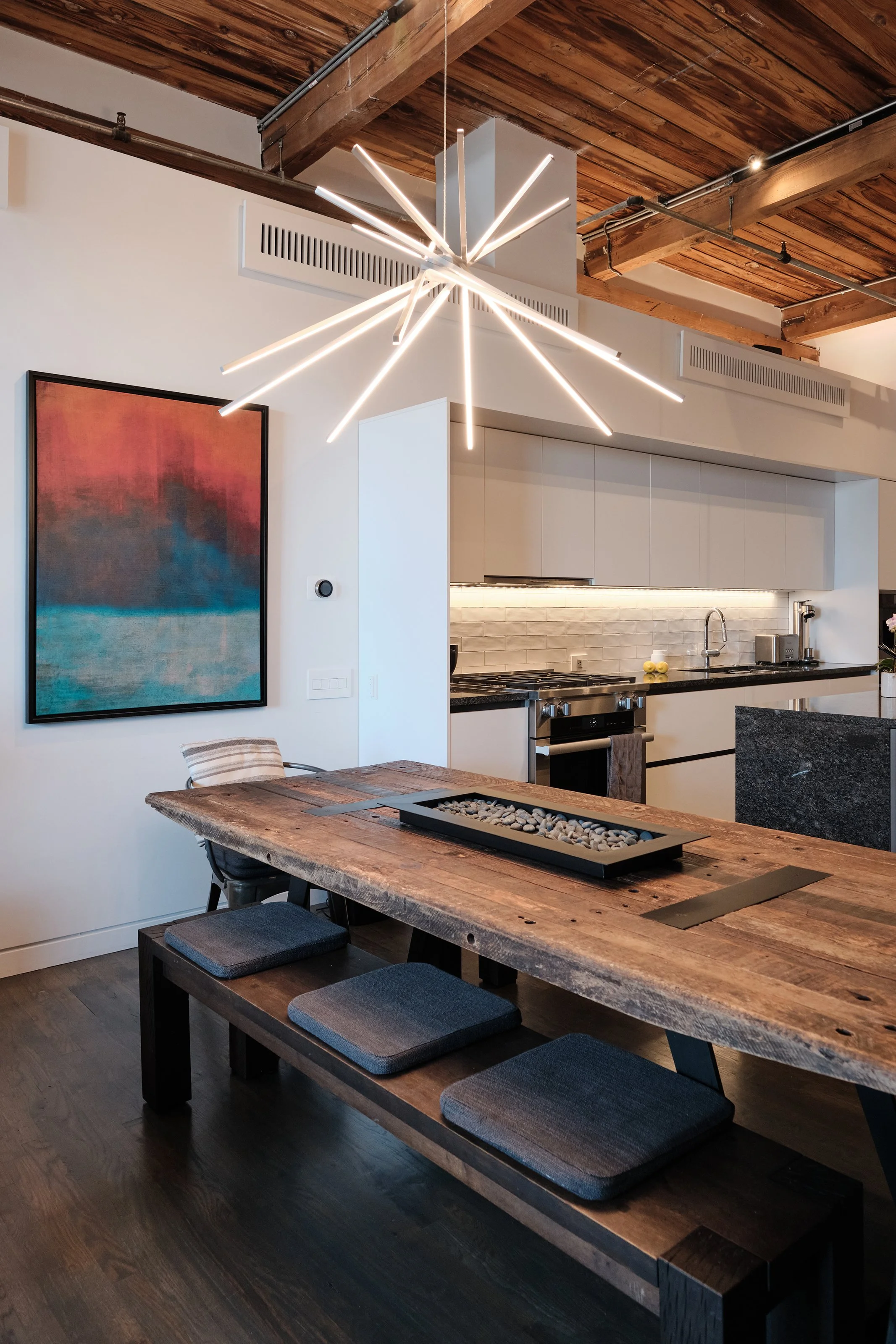
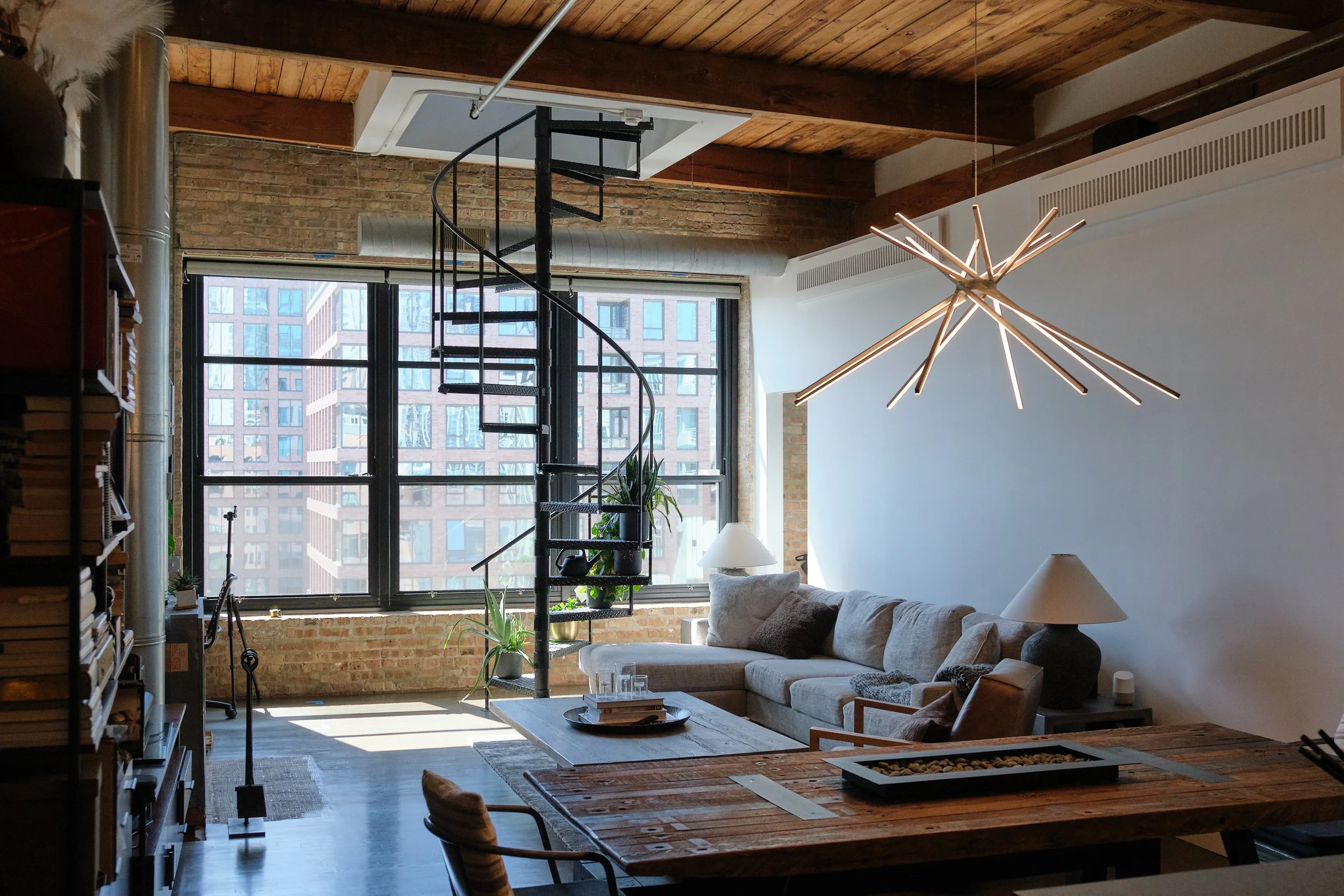
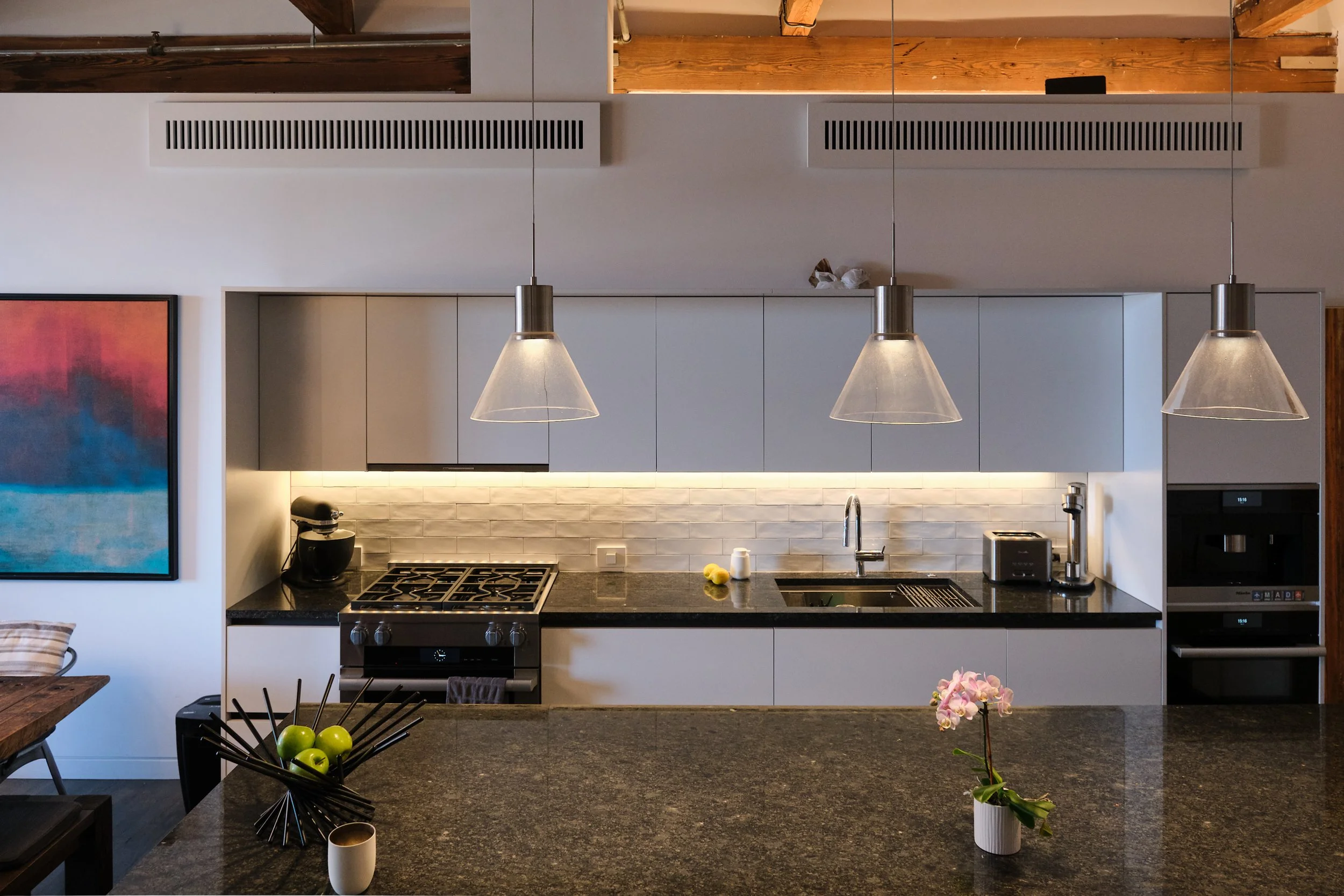
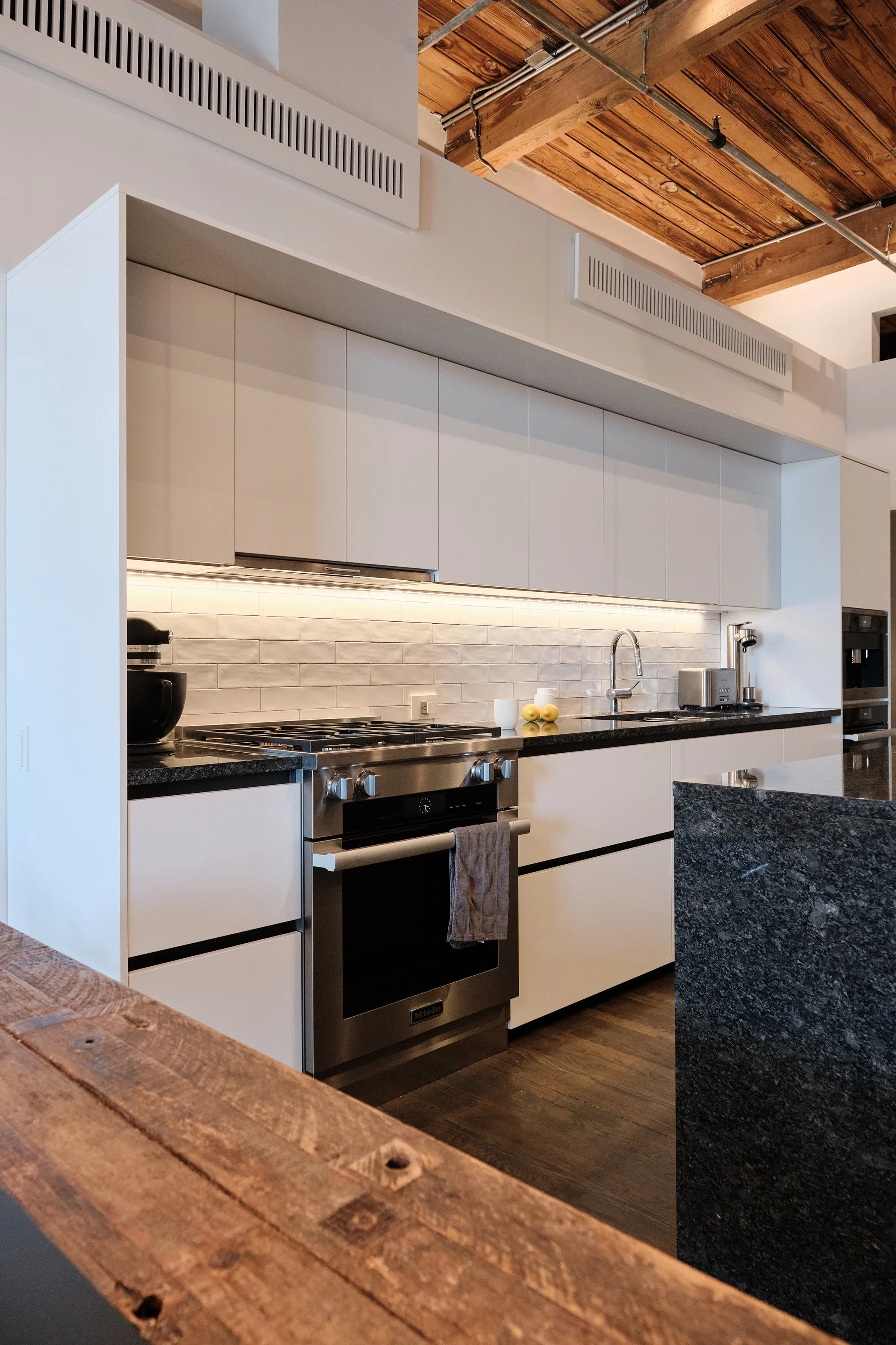
Peoria Street Condo is the complete redesign of a 1500 SF loft in Chicago's West Loop. The design explores the extrusion and layering of multiple boxes into the main living space with carving and subtraction in the private spaces in order to both reveal the substantial original 1915 timber structure and challenge the perception of solid and void relative to that structure.
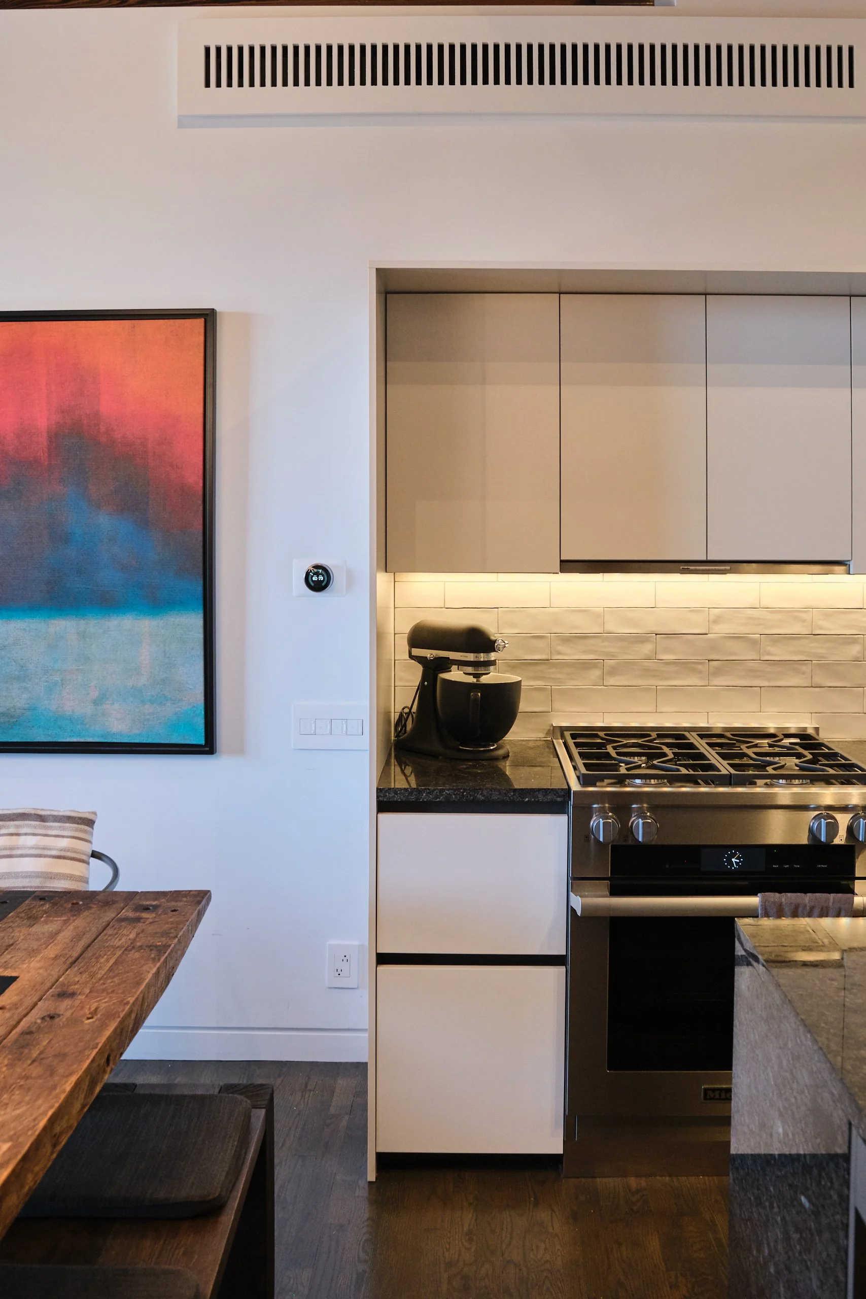
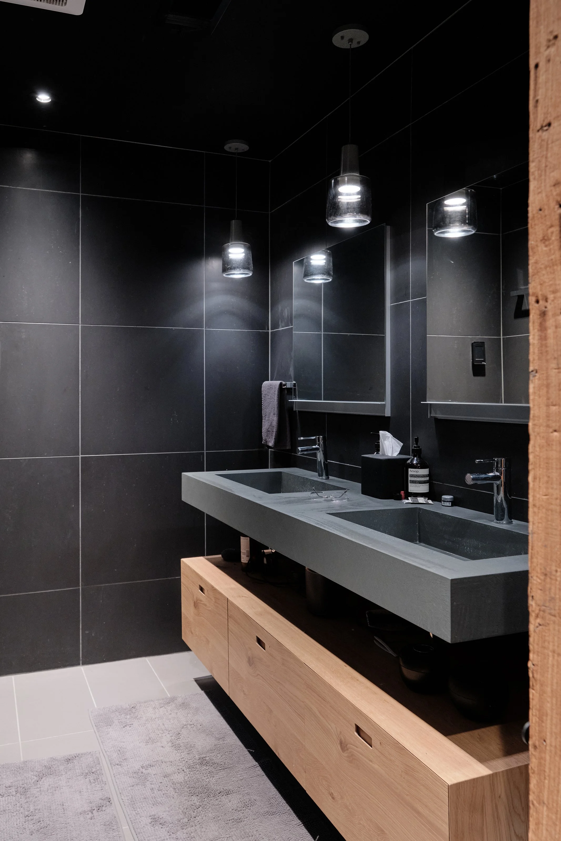
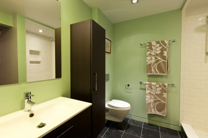
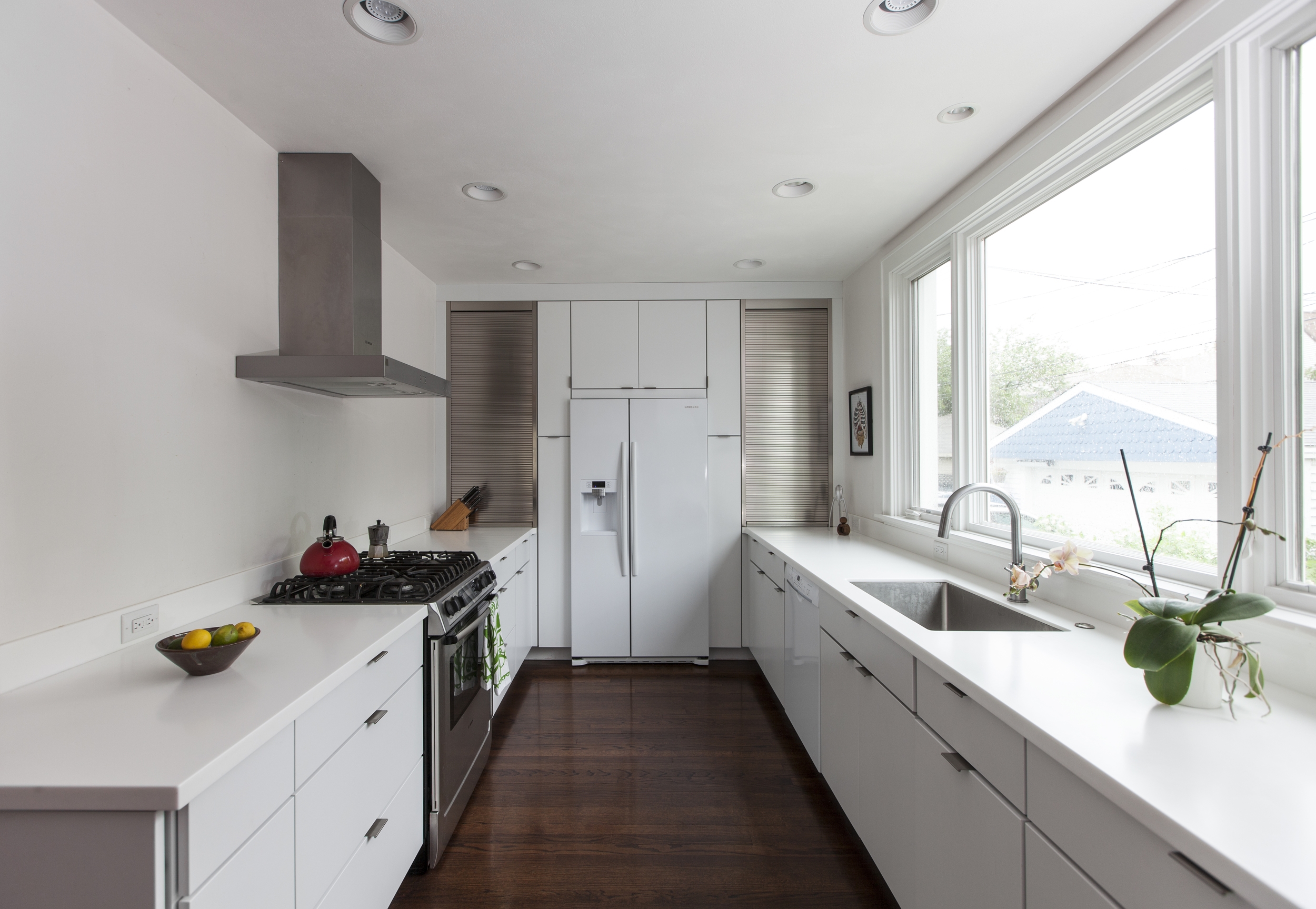
The two bedroom two bathroom space features all new lighting throughout, refinished and salvaged wood floors in the main living space, and pocket doors with Italian door hardware. the kitchen is highlighted by a 10 foot carrara marble island with breakfast bar opposite quartz countertops complete with undercount zero radius stainless steel sink. White gloss cabinetry with Finnish drawer pulls, a white penny round backsplash, and stainless appliances finish the space. The bedrooms and main living space are articulated with playful pendant lights from Moooi, Patrick Townsend, and Sofie Refer and recessed lighting that mimics door hardware. Both bathrooms feature wall mounted low flow toilets while the guest bathroom is finished with slate floors and a subway tile shower carved from the box form that extrudes into the kitchen. The master bathroom is finished with travertine on the floors and shower walls, white stained oak cabinetry and a cast iron tub.
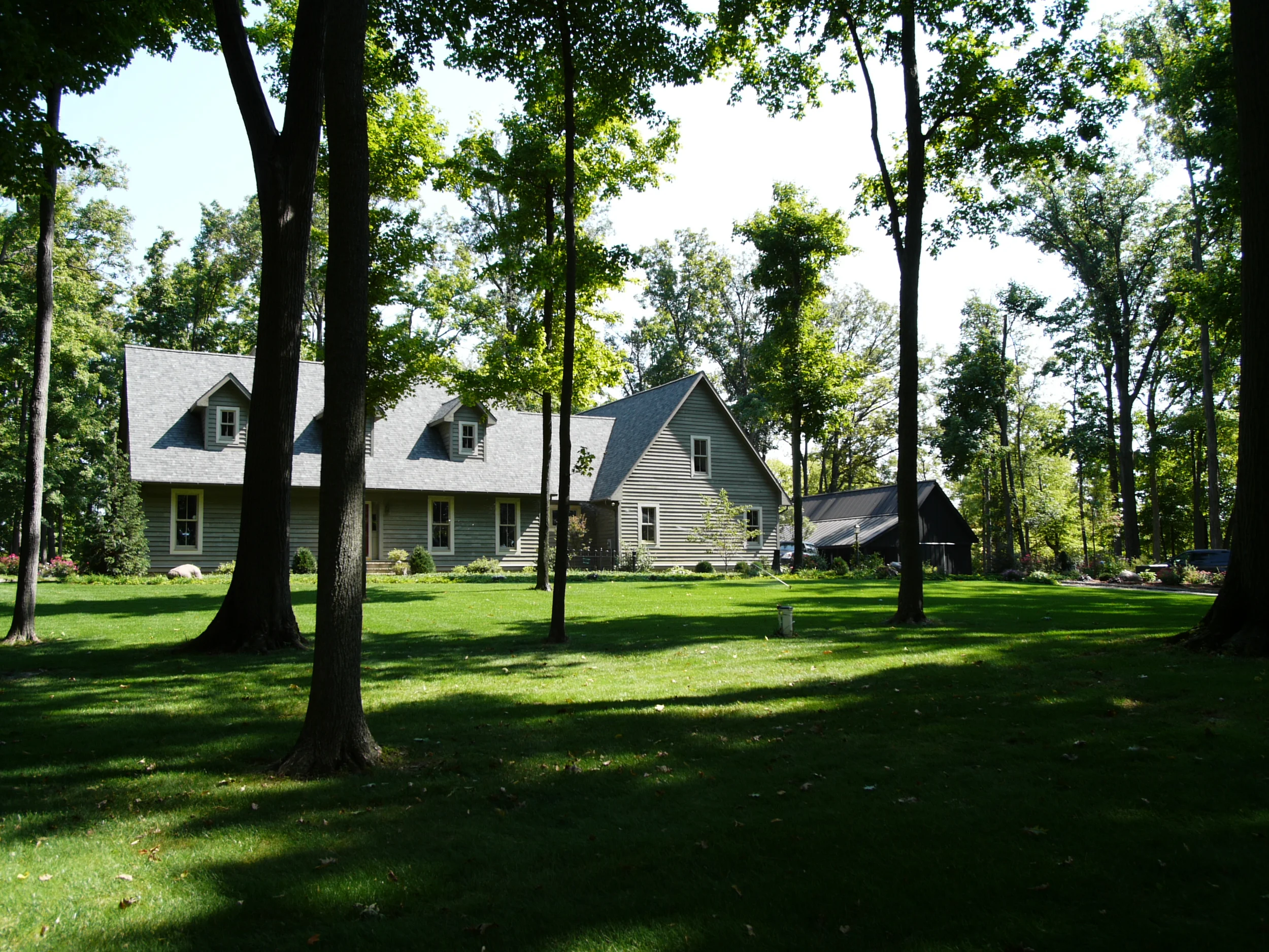
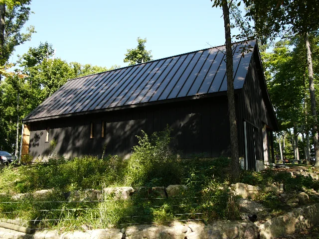
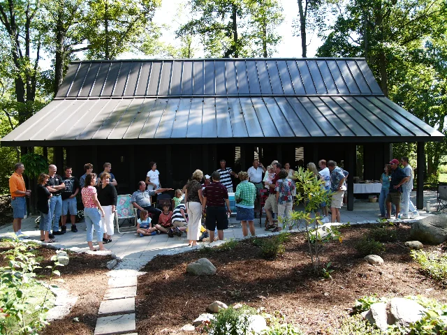
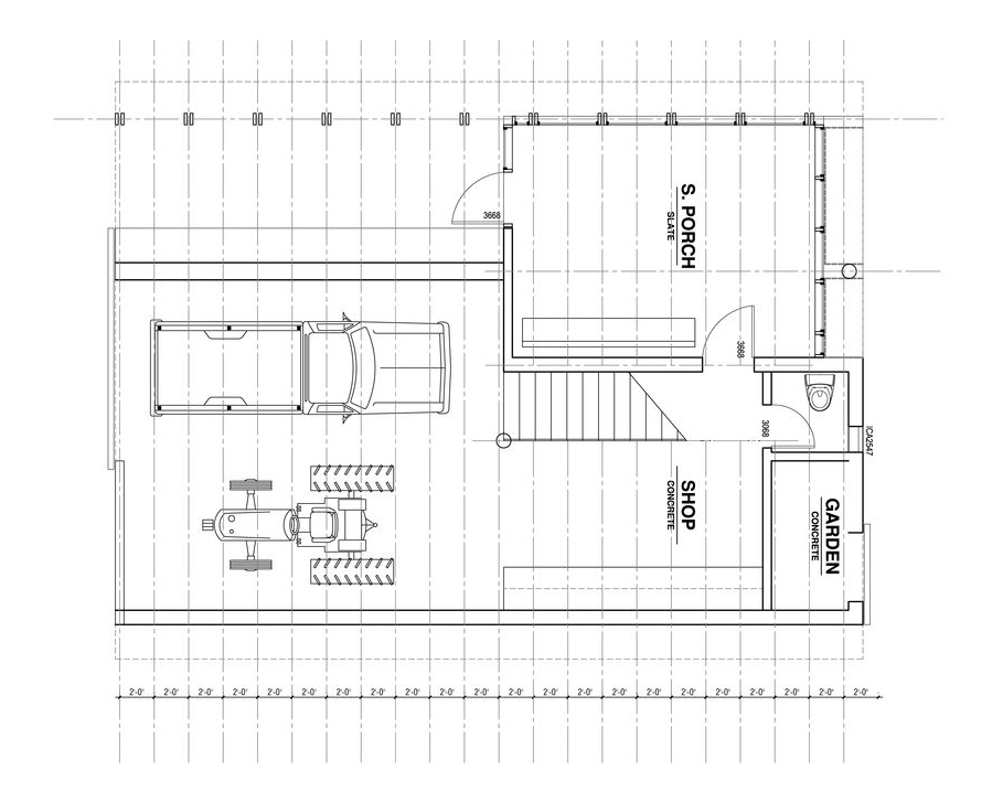
What started as a client's desire to shelter for firewood soon became a substantial site structure assigned the task of absorbing the clutter that accumulates around people and their hobbies. The program expanded to include truck parking, a woodshed, garden shed, screened porch, and a workshop.
The initial modular proportion for the structure derives from the dimensions of a cord of firewood and evolved into a translucent screen wall beneath the overhanging roof. The rest of the design strives for invisibility by carving away at the simple rectangular typology of a traditional tobacco barn. Spaces for the program are subtracted from the cubing volume of the building without compromising its utility.
This project received an Honor Award from the Cincinnati AIA.
Located in Detroit, Empty Pavilion is designed by Kyle Reynolds in collaboration with McLain Clutter and built with University of Michigan students.
The Empty Pavilion is a meditation on Detroit’s evacuated urban context and an experiment in architecture’s ability to activate a latent public in the city. The project aspires to distribute just enough material across empty space – an element Detroit has in excess – to make that space legible and promote interaction. From a distance, the project engages the onlooker in a visual game of fleeting figuration. The pavilion is conceived as a collection of architectural figures drawn-in-space. From certain vantage points, and only momentarily, the project recalls familiar architectural elements that may entice memory – like the roof line of house, a chimney, a hallway, or a staircase. From other vantages, the project presents clear, and yet unfamiliar, architectural figures – thus soliciting projective association. Up-close, the pavilion is meant to encourage physical interaction. Elements within the design suggest differing modes of occupation, such as seating, lounging and climbing. Constructed of bent steel tubing, foam and rubber, the pavilion is counter-intuitively soft to the touch, begging tactile engagement.
The relationship between the pavilion and its site is meant to lend definition to the otherwise unvariegated surrounding emptiness and vaguely recall the site’s history. Located in an empty field that was once divided into a series of residential lots, the project loosely describes the volume of the house that once sat in its place. The design of the ground plane further recalls the absent house, drawing the shape of its shadow in gravel surrounded by the painted profile of that cast by the new pavilion. From within, the pavilion frames views out to historically important civic buildings. For example, traversing a passage carved under and through the pavilion, the project directs one’s view out to the empty shell of Detroit’s monumental Michigan Central Railroad Station. From the opposite direction, the project frames a view of the Renaissance Center, General Motor’s headquarters in Detroit.
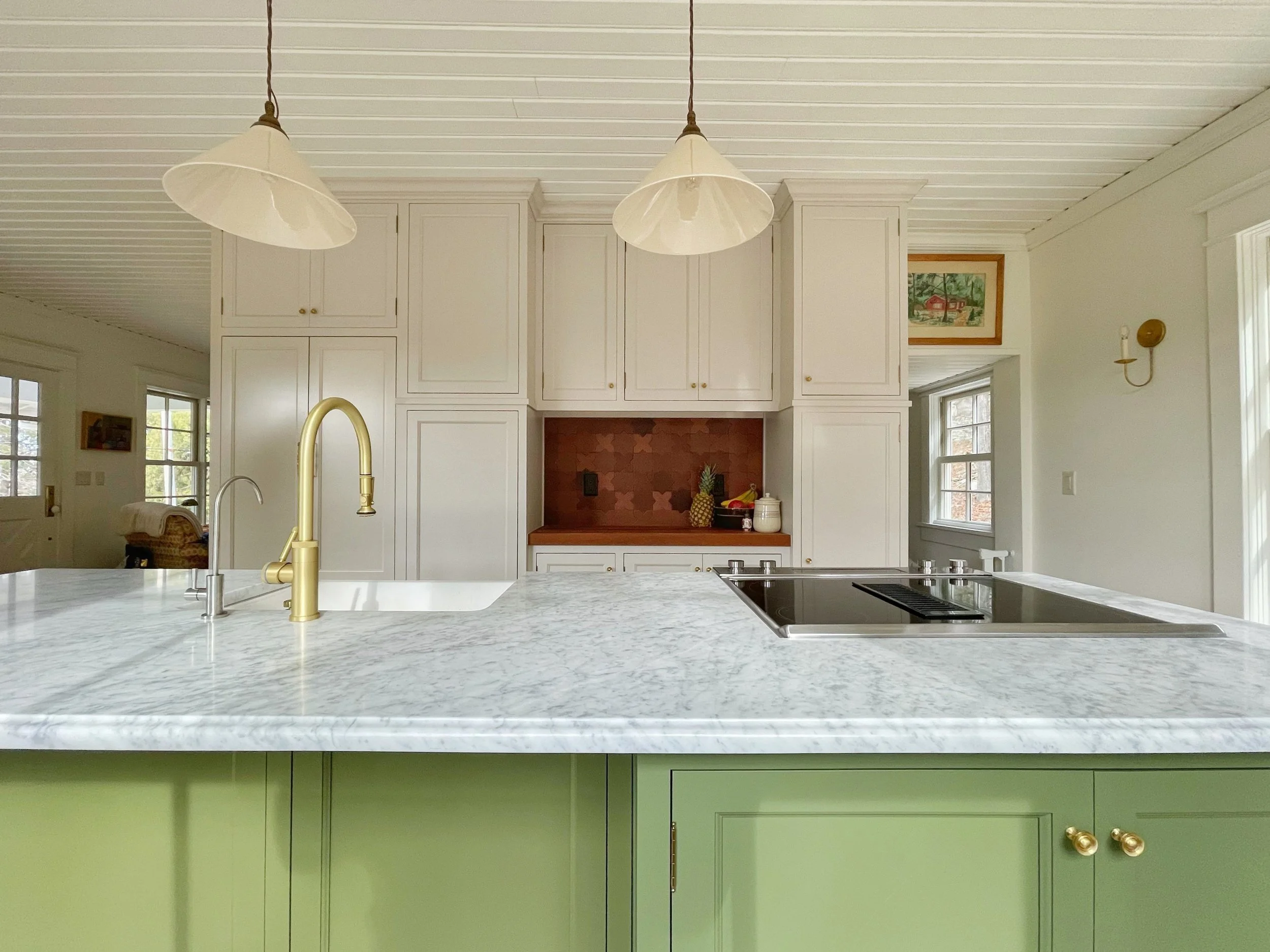
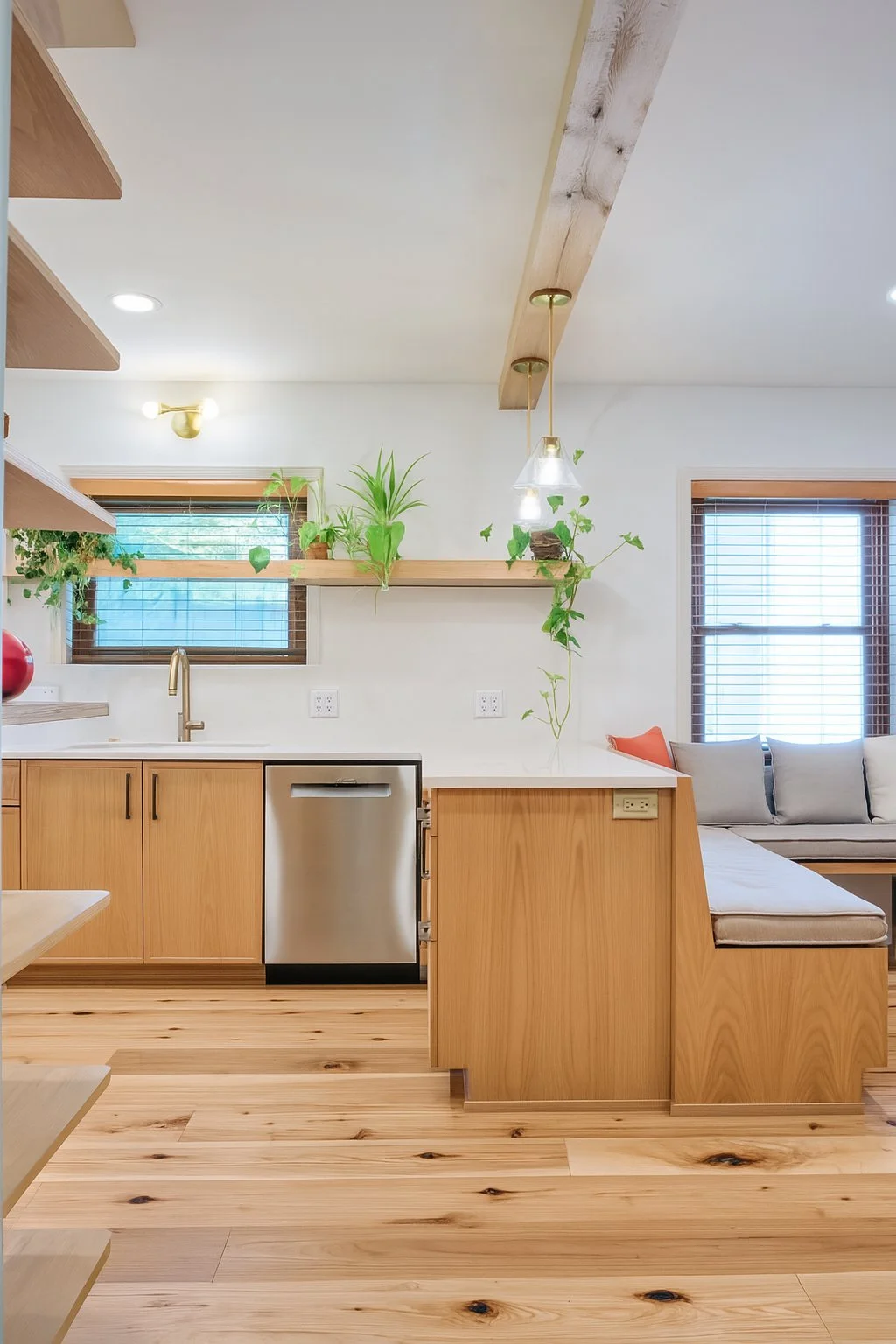
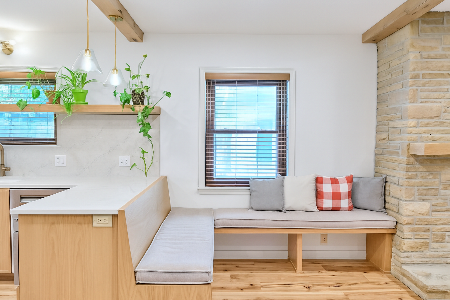
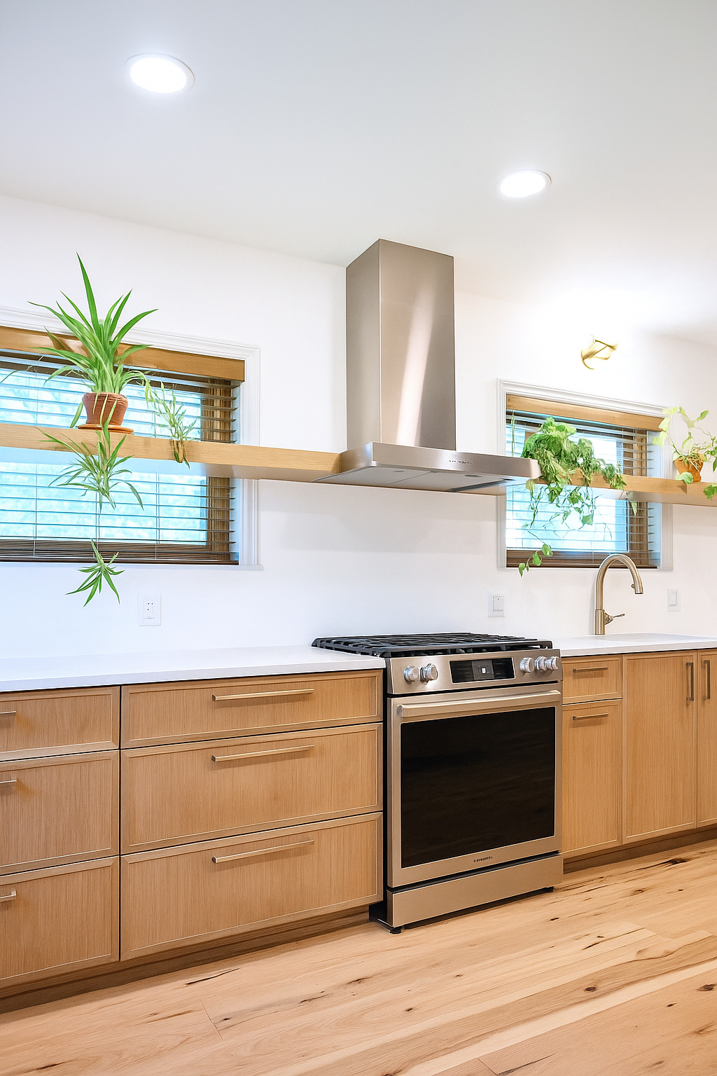
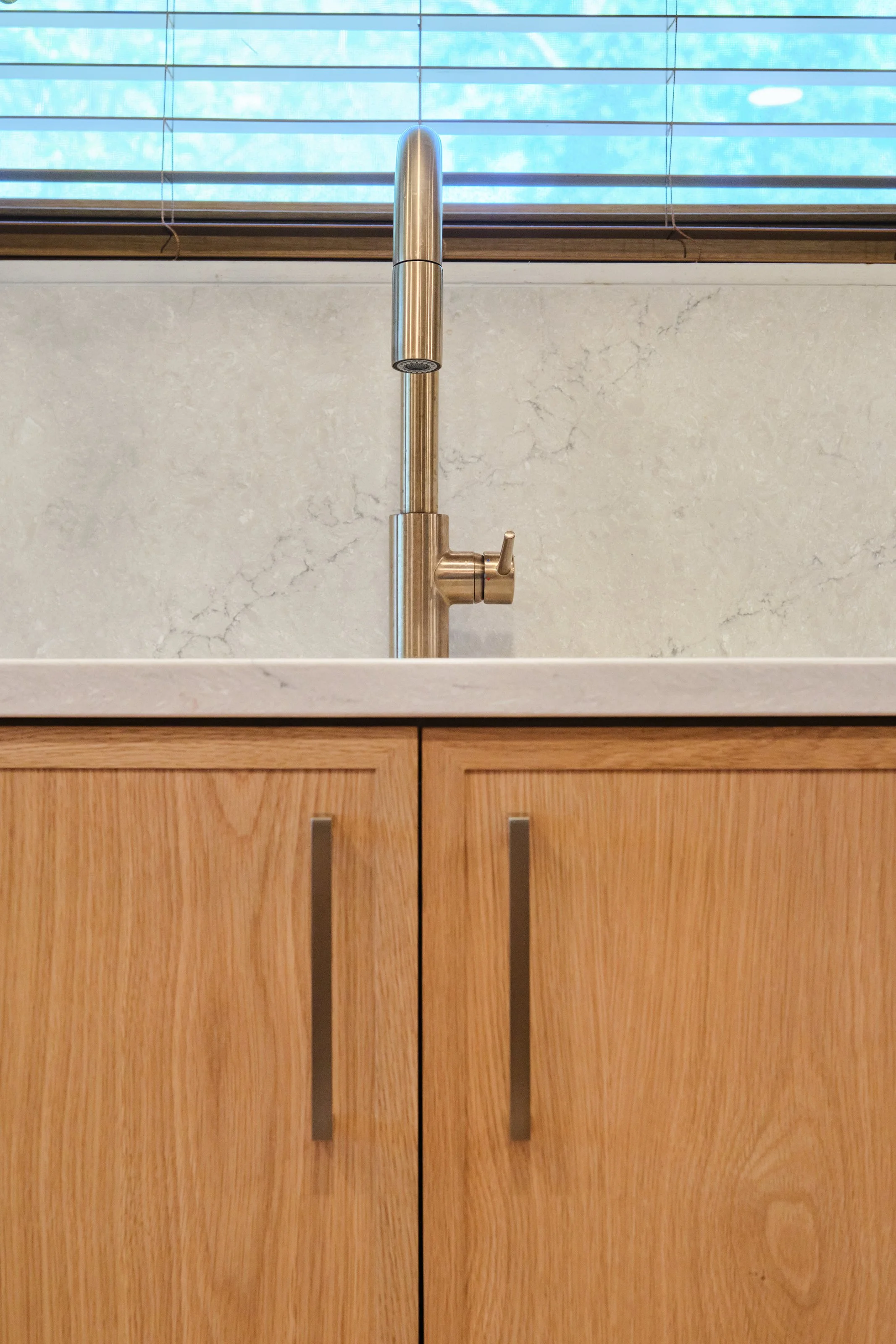
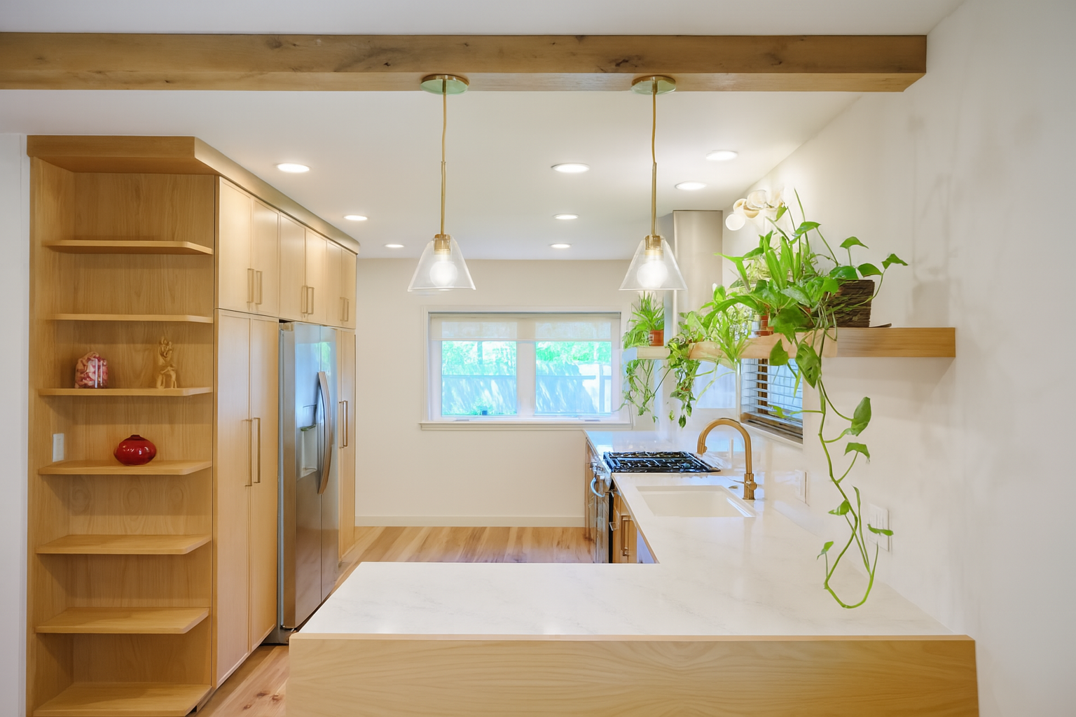
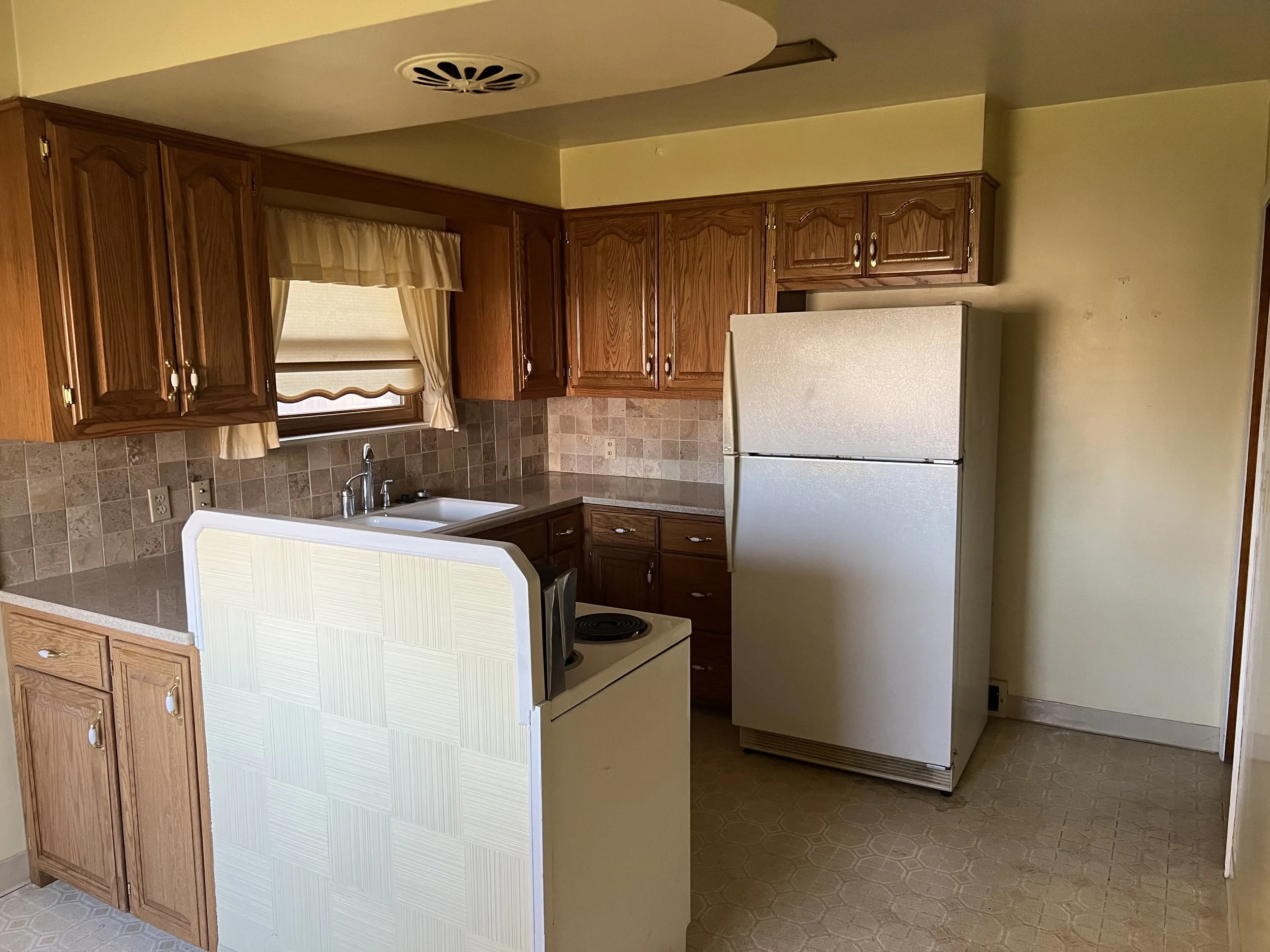
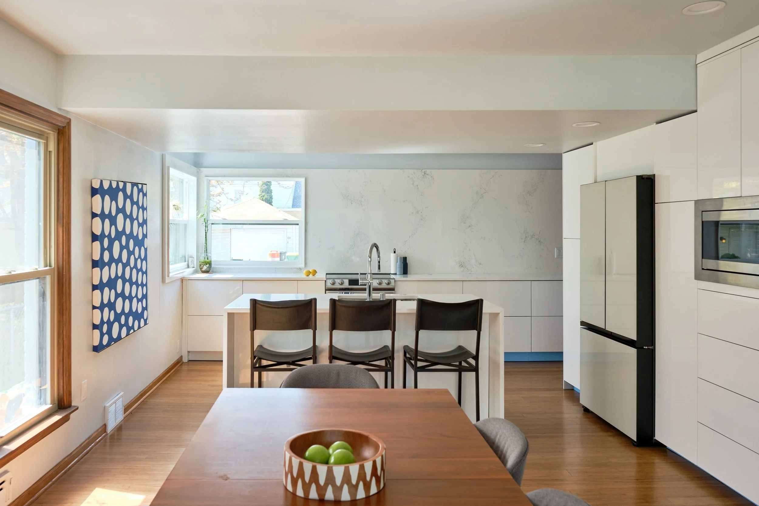
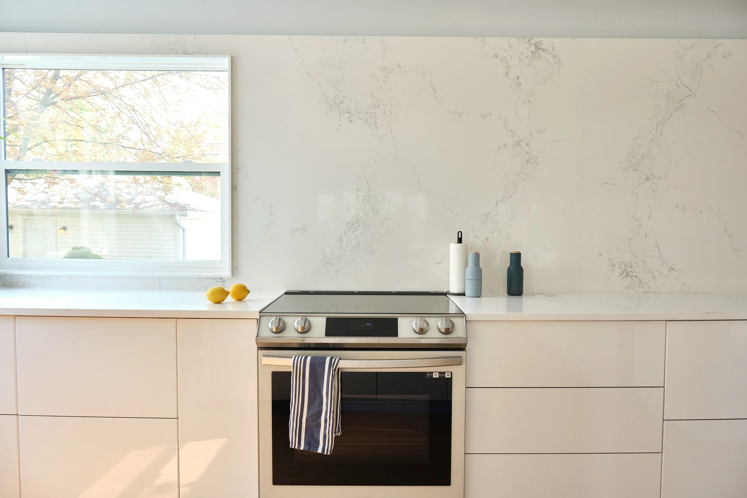
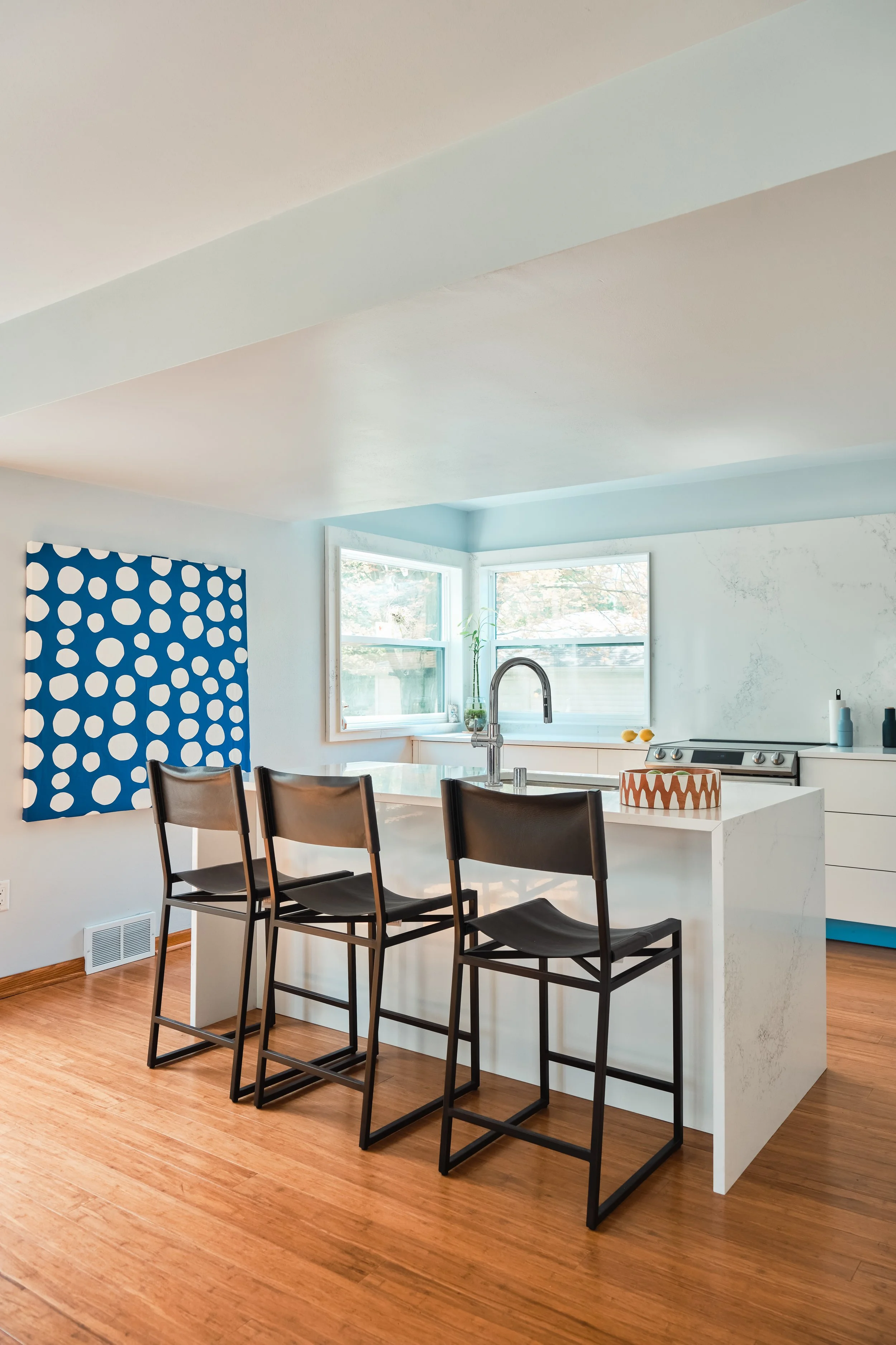
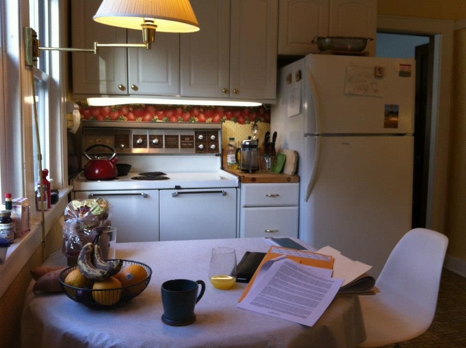
Previously, this traditional 1920's bungalow had a total of 42 linear inches of counterspace divided into three different areas including 12 inches on the original gas stove. The renovation overcompensates for this deficiency by creating over 212 inches of counterspace and making the kitchen a more public space for living and entertaining with a strong connection to the backyard.
Site design and schematic design for a new concert hall at Kinhaven Music School in Vermont. For over 60 years, Kinhaven has offered summer music camps for serious young musicians. Having outgrown their current performance space, they turned to WARE for assistance in envisioning a future concert hall. In addition to suggesting 6 possible site locations, we were also investigating the possibility of re-using a heavy timber structure from a nearby barn.
The structural module of the re-used wooden beams dictated a longer and more narrow form than would typically be used for a concert hall. However the aesthetic of a building that could open to the landscape is well suited to the casual summer atmosphere of the existing camp facilities.
The cramped kitchen in this 1920's center hall colonial still had the original cabinets. Working closely with the owner we opened the space to the dining room to visually enlarge the room without the need for a costly addition. The upstairs bathroom was also a bit claustrophobic due to a heavy soffit over the bathtub which was removed. We brightened the space with the addition of marble and glass to add some reflectivity and depth to the room.
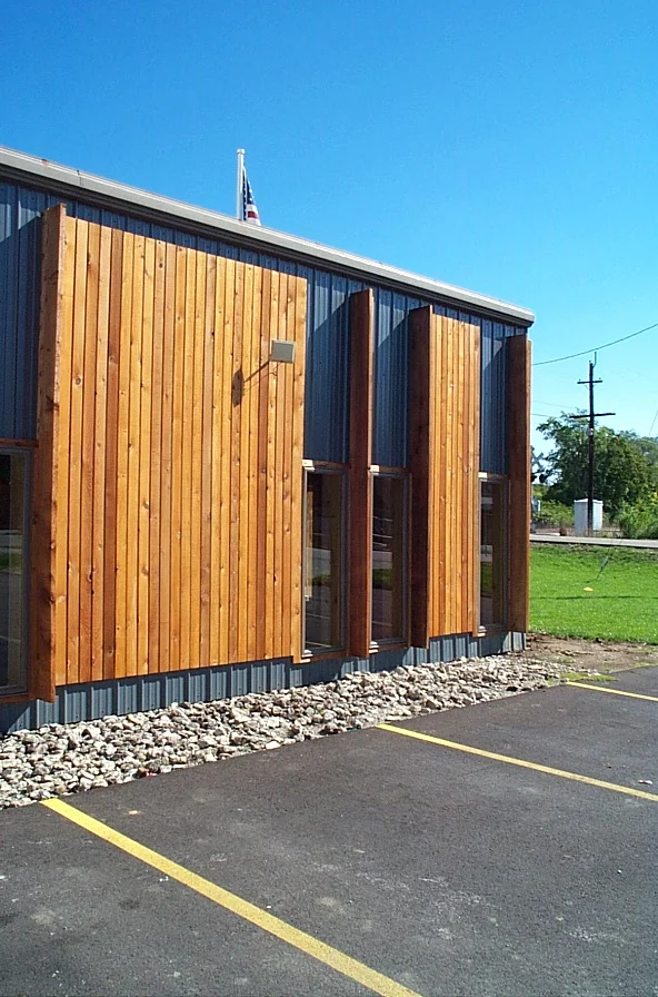
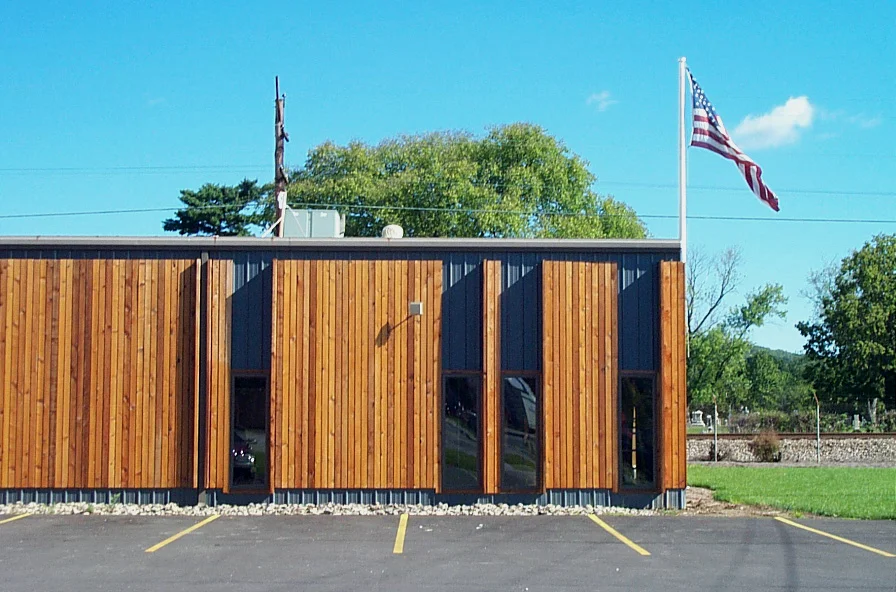
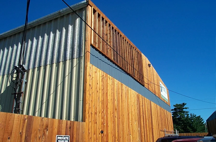
An existing cluster of disparate buildings in need of a face-lift constituted the site for this project. While functional, the existing lumberyard buildings did not present a coherent retail face to the street. A new skin and identity system requiring simple construction skills and minimal cost was required
We translated the cost and skill component of the client brief into a system requiring the fewest cuts/measurements possible. The design for the Newtown Lumberyard face-lift consists of alternating series of 2x2, 2,4, 2x6, and 2x8 cedar boards. Our rules were simple: no cuts allowed. Where windows, downspouts, and doors interrupted the facade we turned boards into fins.
This project received an Honor Award form the Cincinnati AIA.
[Project designed with Drawing Dept]
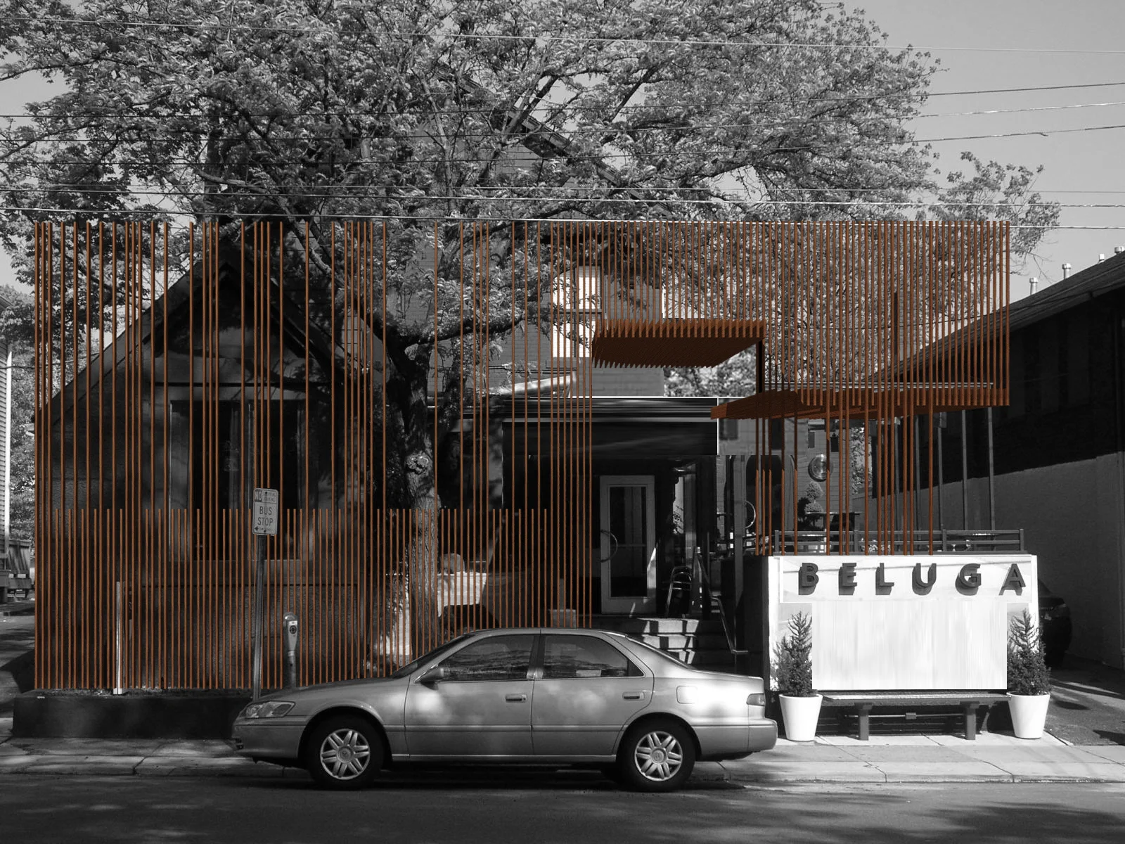
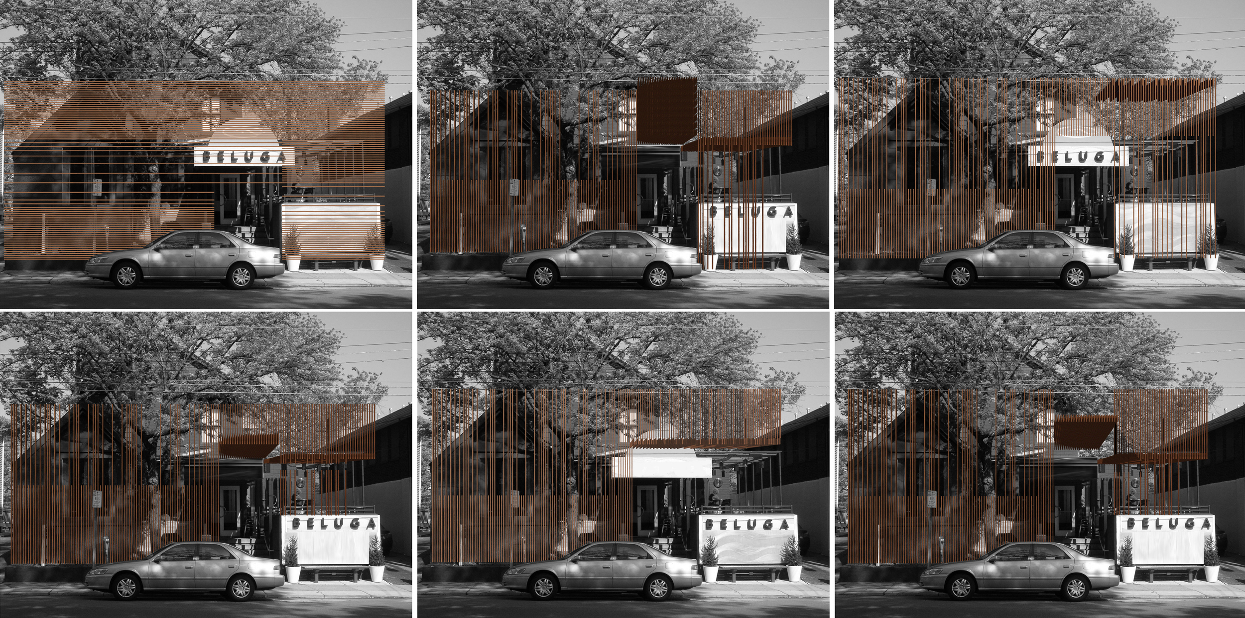
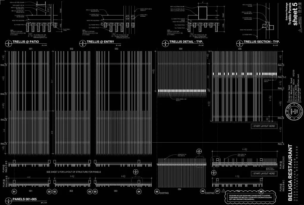
This existing sushi restaurant/nightclub is a tangle of wood-framed additions clustered around a masonry house. The project site also has an ambiguous character occupying a lot between a busy commercial square and a residential neighborhood. The client asked us to establish a new distinctive identity for the restaurant that was compatible with the multi-faceted character of the existing neighborhood.
The proposed exterior screen and canopy seeks to unify the different character of the former additions, shelter an outdoor dining patio, act as an entry threshold, provide a strong urban edge at the sidewalk, and act as a transitional element between the commercial and residential zones. Inside, we used a similar strategy of screens to mask the various soffit heights and light fixtures accrued over the course of several previous renovations. These screens also serve as orientation devices through the contorted hallways.
[Project designed with Drawing Dept]
This proposal for a multi-disciplinary earth sciences field station is a joint project between the University of Cincinnati and the Hamilton County Park District. Containing research, laboratory, and classroom facilities for archaeology, geography, geology, biology, and earth sciences this building will be built in multiple stages over the next several years. The site requires balancing existing Shaker farm structures and historical foundation remnants with a restored wetland and existing agricultural uses.
The proposed scheme is more an elaborate screen porch than high-tech laboratory. A thickened spine of structure defines the boundary between laboratory rooms and the porch corridor. This thickened structure holds the technical needs including lab ventilation, archive storage, sinks and plumbing, natural daylighting, and exhibit areas.
This addition consists of a new 2-car garage, family room, bathroom, and master bedroom suite. Striking views of the Little Miami River Valley conflict with the western solar orientation of this suburban Cincinnati site. We proposed vertical cedar fins to negotiate the view and the sun. These fins were absorbed from their role in solar performance into the structural plane of the faced. An intentionally ambiguous system: sometimes a fin is structural, sometimes for shading, sometimes a rain-screen, sometimes all or neither. Altogether the wood fins are subsumed into a rhythmic cladding which seeks to agitate perceptions of function and decoration.
Only 18 feet wide, this prototypical design proposes a plan for expansive modern living within the constraints of a tight urban lot. The location of windows relative to zones of movement and away from stationary parts of domestic life keeps the interior light-filled, private, and perceptually far larger than its 1800 square foot interior. The kitchen is located centrally and forms the heart of domestic life with adjacency to both the living area and family room (or an optional 4th bedroom).